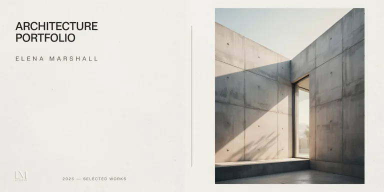
A strong architecture portfolio layout uses a consistent grid, a limited type palette, and generous white space so each project reads in seconds. Reviewers scan from top-left to bottom-right, so a clear cover page, logical page flow, and disciplined hierarchy matter more than decorative effects. Design the document to guide the eye, not to impress with density.
Most students lose interviews not because the work is weak but because the layout buries it. Hiring architects review dozens of portfolios per opening, often for under a minute each on the first pass. Your architecture portfolio layout is the system that decides whether your best drawing gets noticed or skipped. This guide breaks down the grid, typography, white space, cover page, and page sequence that make a portfolio feel professional, and shows how each decision affects how quickly a reviewer understands your work.
What makes a good architecture portfolio layout?
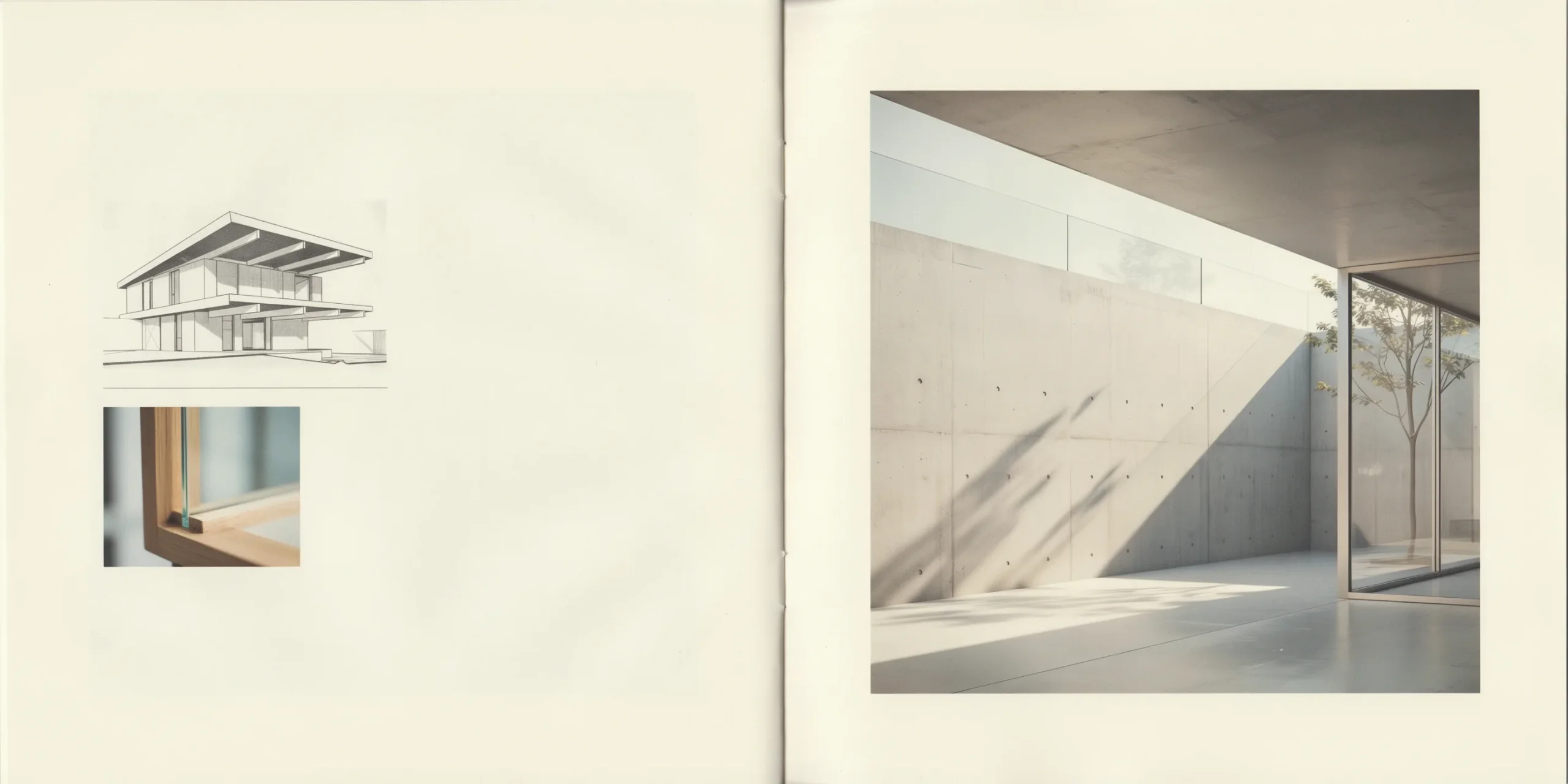
A good architecture portfolio layout is consistent, legible, and hierarchical. It repeats the same grid, margins, and fonts on every spread so the reader focuses on the work rather than the formatting. It gives each project a clear hero image, a short caption, and enough white space to breathe. Consistency signals discipline, which is exactly what employers screen for.
Professional bodies reinforce this. The American Institute of Architects treats clear communication of design intent as a core competency for emerging professionals, and the NCARB AXP Portfolio evaluates candidates partly on how legibly their submitted exhibits convey intent. The same standard that governs licensure documents applies to your job-hunting portfolio: the layout exists to make the idea readable.
If you are still planning the document as a whole before refining its layout, start with our complete architecture portfolio guide, which covers project selection, length, and narrative. This article focuses specifically on the visual system that holds everything together.
⚠️ Common Mistake to Avoid
Filling every page edge to edge is the most common layout error in student portfolios. Cramming six images, three diagrams, and a wall of text onto one spread forces the reader to work, and tired reviewers skip work. Show fewer pieces larger, and let white space frame the drawing that matters most.
Build the layout on a grid system

A grid is the invisible structure that aligns images, text, and captions across every page. Choose one column grid and apply it consistently. As Smashing Magazine puts it in its primer on layout grids, a grid is the glue that holds a design together and lets you achieve hierarchy and alignment with little effort. For a print or PDF architecture portfolio, a 12-column grid is the most flexible because it divides cleanly into halves, thirds, and quarters.
Set margins and gutters first

Before placing a single image, define your margins and gutters. Wide outer margins, roughly 15 to 20 millimeters on an A4 page, give the layout air and protect content from being cut at the spine or trim line. Keep gutters between columns consistent, commonly 5 to 6 millimeters. These numbers stay identical on every page so the eye locks onto a stable frame.
Use a modular grid for mixed content

Architecture projects mix renders, plans, sections, diagrams, and text, which is exactly what modular grids handle well. A modular grid divides the page into rows and columns, creating cells you can combine to size each element. Span four columns for a hero render, two for a section, one for a caption. The cells keep everything aligned even when the content types vary wildly from page to page.
💡 Pro Tip
Build a master page in InDesign with your grid, margins, page numbers, and project-title placeholder, then duplicate it for every project. This guarantees alignment stays pixel-consistent across 40 pages and saves hours of manual nudging. When you change a margin once, it updates everywhere.
Once your grid is set, study how published portfolios apply theirs. Browsing real architecture portfolio examples shows how a single repeated grid can carry housing, urban, and pavilion projects without looking repetitive, because the work changes while the frame stays calm.
Choose typography that stays out of the way

Typography in an architecture portfolio should be quiet. Pick one or two typefaces and build a clear hierarchy: a larger weight for project titles, a medium size for headings, and a smaller, comfortable size for body and captions. A single clean sans-serif, such as Helvetica, Inter, or Neue Haas, handles an entire portfolio well. The goal is legibility, not personality, because the drawings carry the personality.
Limit sizes and weights
Restrict yourself to three or four type sizes total across the whole document. Set body text around 9 to 11 points for print and keep line length to roughly 60 to 75 characters so captions stay readable. Use weight and size, not color, to signal importance. A title in bold at 24 points and a caption in regular at 9 points create instant hierarchy without any decoration.
📌 Did You Know?
The grid and limited-typeface approach used in most architecture portfolios traces back to the Swiss School of graphic design from the 1950s, the same movement Smashing Magazine credits with formalizing modern modular grids. Architects adopted it because it makes complex technical information read in a predictable order.
Use white space as a design tool
White space is not wasted space. It groups related elements, separates unrelated ones, and tells the reader where to look first. The Nielsen Norman Group notes in its work on the proximity principle that placing a caption close to its image, and farther from the next section, communicates grouping without any lines or boxes. In a portfolio, that means letting a hero render sit alone with margin around it rather than surrounding it with competing thumbnails.
Practically, give each project at least one near-empty spread that presents a single dominant image. The contrast between a dense analytical page and a quiet hero page creates rhythm, and rhythm keeps a reviewer turning pages. Density everywhere reads as anxiety; controlled emptiness reads as confidence.
💡 Pro Tip
Apply the proximity principle to captions: set them within 4 to 6 millimeters of the image they describe and at least double that distance from the next element. Reviewers should never guess which caption belongs to which drawing, especially on dense analysis pages.
How to design the cover page of an architecture portfolio
Design the cover page of an architecture portfolio to be simple and confident: your name, the word portfolio or your discipline, a year, and one strong image or a clean typographic treatment. Avoid clutter, stock graphics, and busy backgrounds. The cover sets the tone for the entire document, so it should signal restraint and clarity, not maximum effort.
Many of the strongest covers use either a single striking project image cropped large, or pure type on a plain field. Both work because they promise the reviewer an organized experience. Follow the cover with a short contents page and a one-paragraph profile so the reader knows who you are before the first project. Keep the same typeface and margin system you use inside, so the cover feels connected to the body rather than bolted on.
Sequence pages for a logical flow
Order projects so the strongest work appears first and last, with a clear narrative inside each project. A reliable per-project sequence runs from context and concept, through site and program diagrams, into plans and sections, and ends with the final renders and a model photo. This mirrors how architects actually develop a design, and it lets a reviewer follow your reasoning rather than just admire images.
Lead with your single best project, because the first 30 seconds decide whether the reviewer keeps reading. Place your second-strongest project at the end so the portfolio closes on a high note. Bury weaker or academic exercises in the middle, or cut them entirely. Three excellent projects beat seven uneven ones every time.
🔢 Quick Numbers
- 2 to 3 colors maximum in a cohesive palette, drawn from the work itself (illustrarch presentation-board guidance)
- 1 consistent grid system applied to every page, per AIA and RIBA formatting standards
- 3 to 4 type sizes total to keep hierarchy clear without clutter
Once the sequence is set, it helps to get a second read on whether the flow actually lands. You can pressure-test the order, hierarchy, and pacing of your draft with Portfolio Mentor by uploading the PDF and reviewing the feedback on our how it works page, which walks through what the review covers before you send the portfolio to a firm.
Keep color and consistency disciplined
Limit your palette to two or three colors, and pull them from the projects rather than imposing a brand color over everything. A neutral base of black, white, and one accent reads as professional and lets your renders supply the color. Apply the palette the same way on every page: the same accent for headings, the same gray for captions, the same background everywhere.
Consistency is the quiet signal employers notice. When margins, fonts, caption styles, and page numbers repeat without variation across 30 or 40 pages, the portfolio communicates that you control detail. That control is the skill firms are hiring for, which is why a disciplined architecture portfolio layout often matters as much as the projects inside it.
Frequently asked questions
What is the best page size for an architecture portfolio layout?
A4 landscape is the most common and practical choice because it suits horizontal renders, prints easily, and reads well on screen. A4 portrait and square formats also work, but whichever you pick, keep it consistent across the whole document and design the grid to fit that proportion.
How many fonts should an architecture portfolio use?
One or two typefaces is ideal. A single clean sans-serif used at three or four sizes creates enough hierarchy for titles, headings, body, and captions. Adding more fonts usually weakens the layout rather than improving it.
How much white space is too much in a portfolio?
White space is rarely excessive if it serves hierarchy and grouping. The risk is the opposite: too little. Reserve generous margins around hero images and keep captions close to their drawings, and the layout will read as intentional rather than empty.
Should the cover page match the inside layout?
Yes. Use the same typeface, margins, and overall restraint on the cover as inside the document. A cover that matches the interior signals a coherent system, while a flashy cover over a plain interior reads as inconsistent.
Key Takeaways
- Build every page on one consistent grid with fixed margins and gutters.
- Use one or two typefaces at three to four sizes for clear hierarchy.
- Treat white space as a tool: keep captions close to images, give hero renders room.
- Design a simple, confident cover that matches the interior system.
- Sequence projects strongest-first and strongest-last, with a logical narrative inside each.