
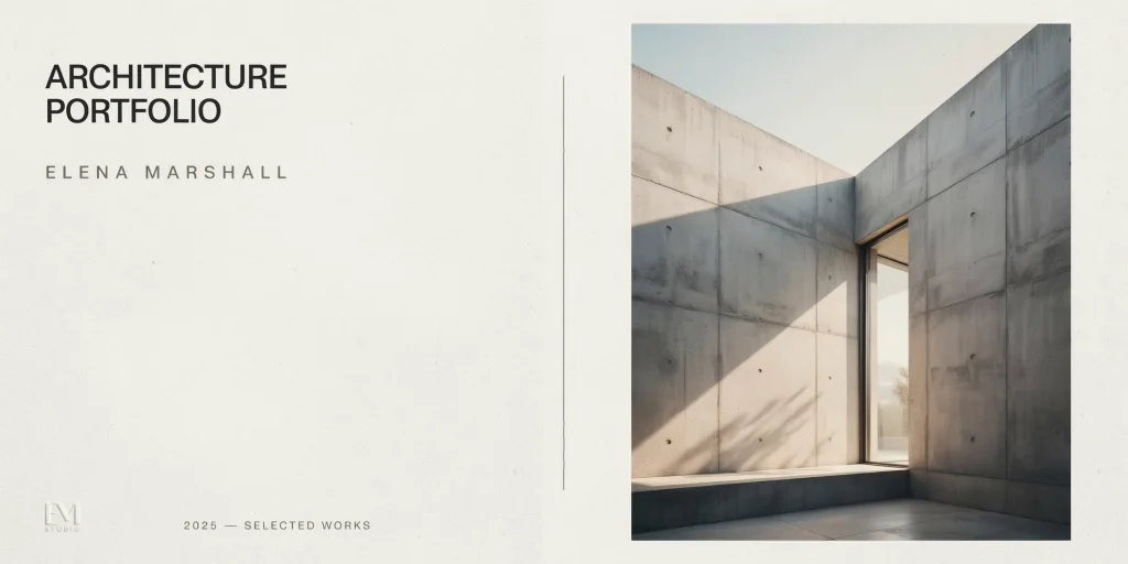
An architecture portfolio cover page is the first thing a hiring architect or admissions committee sees, and it sets the tone for every page that follows. A strong cover combines your name, a clear portfolio title, restrained typography, and a single confident visual or generous white space, signaling design judgment before a reviewer opens a single project.
Reviewers at firms and graduate programs often skim dozens of portfolios in a sitting, so your cover has only seconds to communicate competence and care. Get the architecture portfolio cover page right and you buy goodwill for the work inside; get it wrong, with cluttered type or a weak image, and you start from a deficit. This guide breaks down exactly what to include, how to handle typography and layout, and how to design a first impression that reads as professional rather than decorative.
What should an architecture portfolio cover page include?

At minimum, an effective cover page carries your full name and a portfolio title. Beyond that, the appropriate level of detail depends on context. For a job application sent as a PDF, many architects add contact information so the page works as a standalone first slide. For a printed academic portfolio, schools such as Syracuse University School of Architecture advise keeping the front cover stripped down to just your name, with contact details moved to the back cover.
- Your full name: the single non-negotiable element, set as the visual anchor.
- Portfolio title or descriptor: “Architecture Portfolio,” your degree, or a short tagline that frames the work.
- Contact information: email, phone, and website or portfolio URL for digital and job-application covers.
- Year or date range: useful for selected-works covers, though avoid semester or course numbers.
- One visual or deliberate white space: a drawing, render, or photo that reflects your style, or clean negative space.
Resist the urge to crowd the cover with every credential. Indeed’s career guidance recommends a readable title, your name and professional title, and contact details, then stopping. The cover introduces you; the projects prove you.
⚠️ Common Mistake to Avoid
Treating the cover like a resume. Listing your GPA, every software skill, and three phone numbers signals anxiety, not confidence. Reserve credentials for your CV and the about section, and let the cover carry only your name, a title, and the essentials a reviewer needs to contact you.
How do typography and hierarchy work on a cover page?

Typography is where most covers are won or lost. Because the cover has few elements, every choice in typeface, size, and spacing is magnified. The goal is a clear hierarchy: your name reads first, the title second, and supporting details last. Adobe’s portfolio cover guidance stresses using font size, weight, and style to differentiate your name, the portfolio title, and any supporting text so the eye moves through the page in a deliberate order.
Limit yourself to one or two typefaces. A single well-chosen typeface used at varying weights almost always looks more disciplined than two competing fonts. Many architects favor a clean sans-serif such as Helvetica, Akzidenz-Grotesk, or a geometric grotesque for a contemporary feel, while a restrained serif can suggest a more editorial or classical sensibility. Schools including Syracuse explicitly recommend a single font style throughout the document, and that consistency should begin on the cover.
💡 Pro Tip
When setting your name, increase the letter-spacing (tracking) slightly on uppercase type, around 50 to 100 units in InDesign. Tight default tracking on all-caps reads as cramped, while a touch of breathing room makes a name feel intentional and architectural without drawing attention to itself.
Watch your type sizes. A name set too small reads as timid, while a title blown up to fill the page reads as shouting. Indeed suggests titles at a minimum of roughly 18 points, but on a full A4 or A3 cover your name will usually sit larger. Align elements to a consistent baseline or margin so nothing floats arbitrarily. If you are still building your overall layout discipline, our architecture portfolio templates and InDesign architecture portfolio guides walk through grids and master pages that keep the cover aligned with everything after it.
What are the best cover page layout approaches?
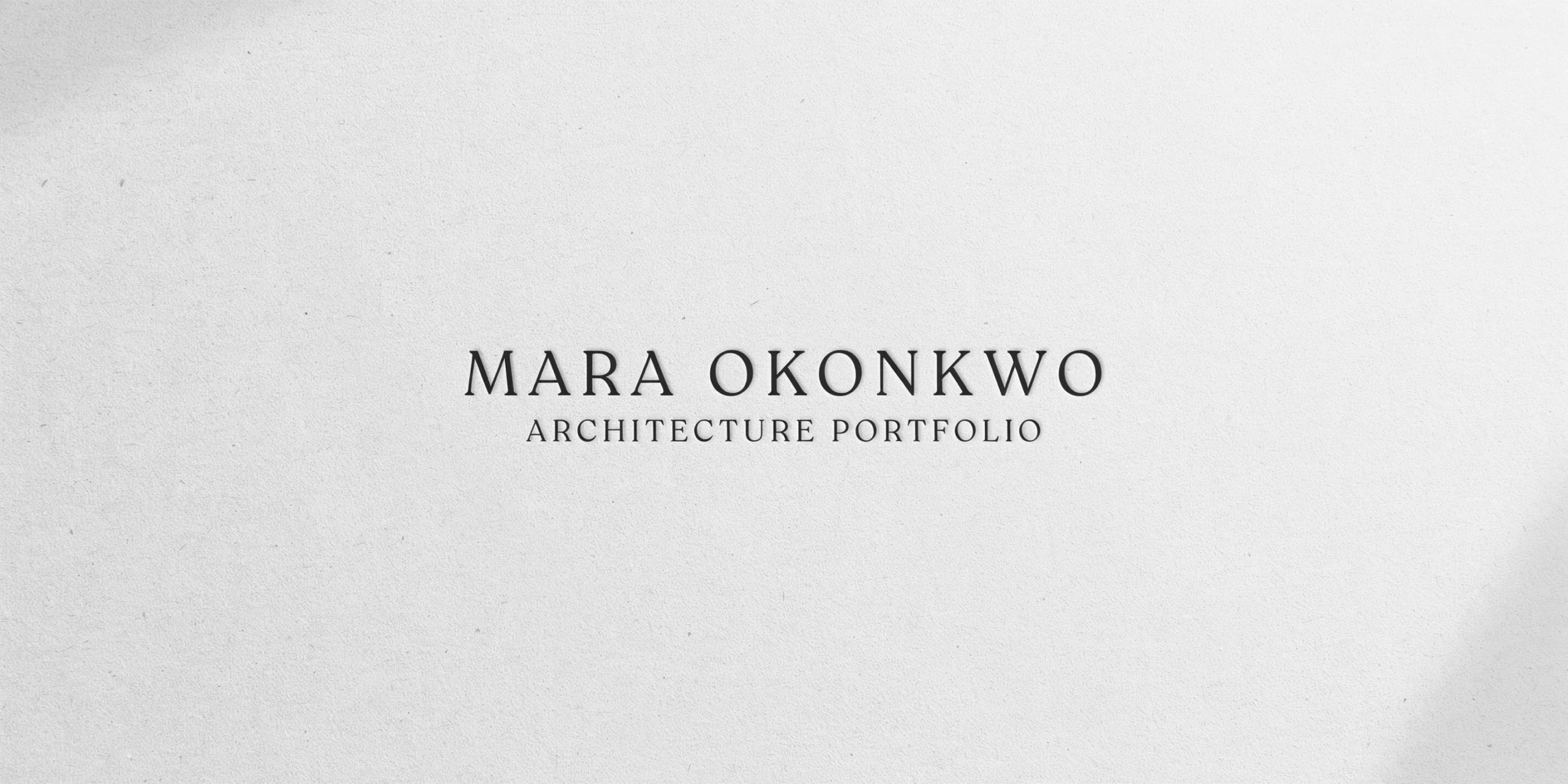
There is no single correct cover, but most successful architecture covers fall into a few reliable families. Choosing one and executing it cleanly beats inventing something elaborate.
- Minimal type-only: name and title on a plain or lightly textured ground, with generous white space. The safest, most timeless option.
- Single hero image: one carefully chosen render, model photo, or drawing that fills or anchors the page, with type overlaid or set beside it.
- Graphic-minimal: geometric elements, a fragment of linework, or a partial plan used as an abstract motif to suggest spatial sensibility.
- Full-bleed visual: an image or solid color block extending edge to edge, with type reversed out in white or a contrasting tone.
The full-bleed approach is the highest risk. As archisoup notes, a full-page image is easy to get wrong if the image quality or composition is weak, because there is nowhere to hide. If you are unsure, default to the minimal type-only or graphic-minimal route, both of which forgive imperfect imagery and still read as considered.
📐 Technical Note
Export covers at 300 DPI for print and place full-bleed images with a minimum 3mm bleed beyond the trim edge so no white slivers appear after cutting. For digital PDFs viewed on screen, set documents to RGB; for printed booklets, convert to CMYK and proof a sample page, since saturated screen colors often shift darker on paper.
Whatever family you pick, the cover should preview the visual language of the interior pages. If your projects use a strict 12-column grid and muted palette, the cover should feel like it belongs to the same document, not a separate flyer.
How do you make a strong first impression?
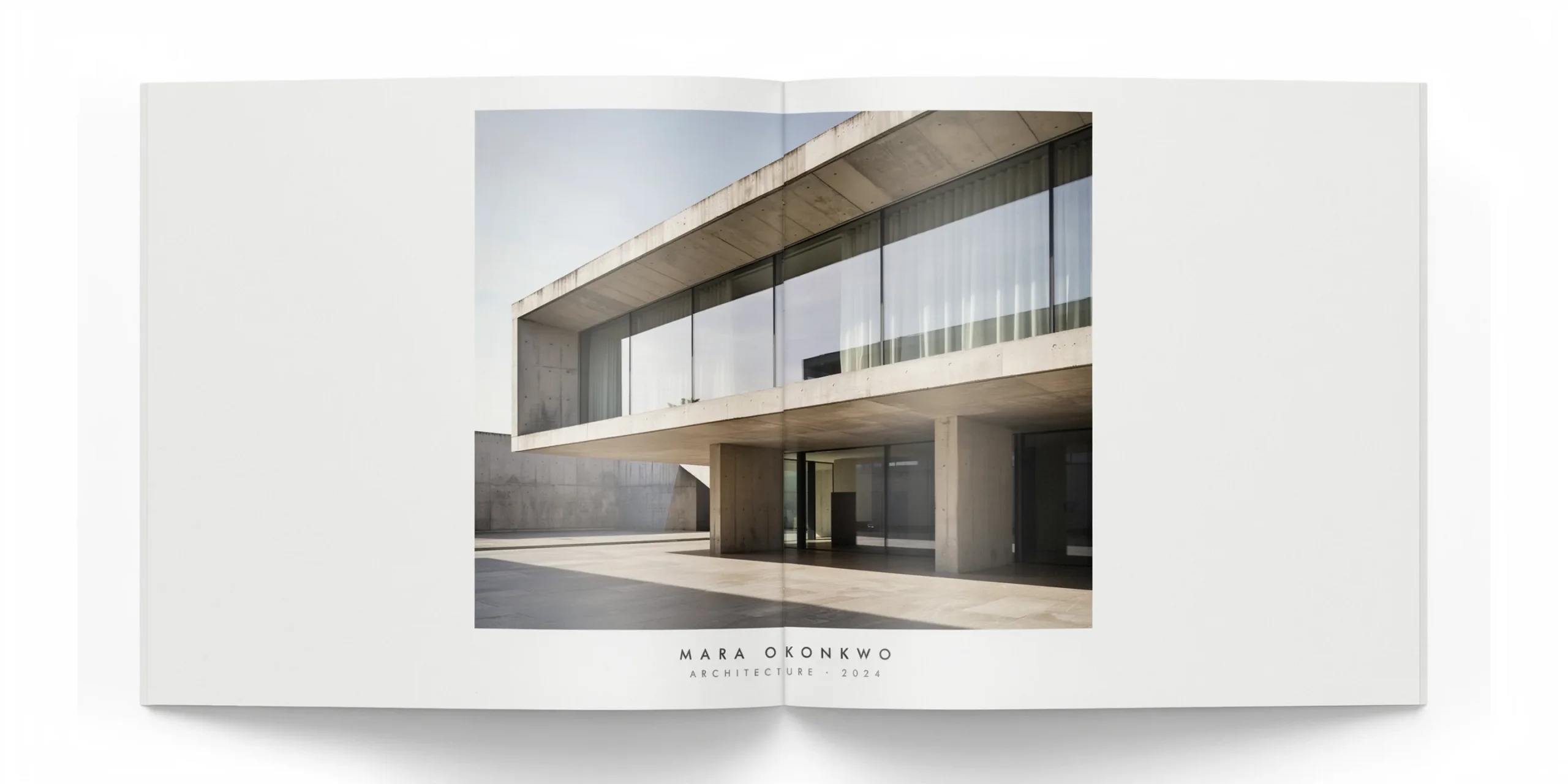
First impressions in a portfolio are about restraint and coherence rather than spectacle. Reviewers read confidence in the things you chose to leave out. White space, a single typeface, and one strong image communicate that you understand editing, which is itself a core architectural skill.
📌 Did You Know?
Most firms reviewing job applications expect a compact sample portfolio of roughly three to five pages alongside your CV, according to archisoup. That means your cover and first project page may be the only spreads a busy hiring architect studies closely before deciding whether to open the full document.
If you include a hero image, choose your single most resolved piece of work, not your favorite or your most recent. A clean axonometric, a striking model photograph, or a well-rendered section often outperforms a busy collage. Keep the image quality high; a pixelated or poorly lit photo on the cover undermines everything inside. The same curation logic that governs the cover applies to project selection, a theme covered in our architecture portfolio mistakes guide.
Consider the medium too. A cover designed for a printed booklet behaves differently from one built for a scrolling website. If you are publishing online, an architecture portfolio website may use a landing hero rather than a fixed title page, so adapt the principles of hierarchy and restraint to that format rather than copying a print cover verbatim.
Cover pages for job applications versus graduate school
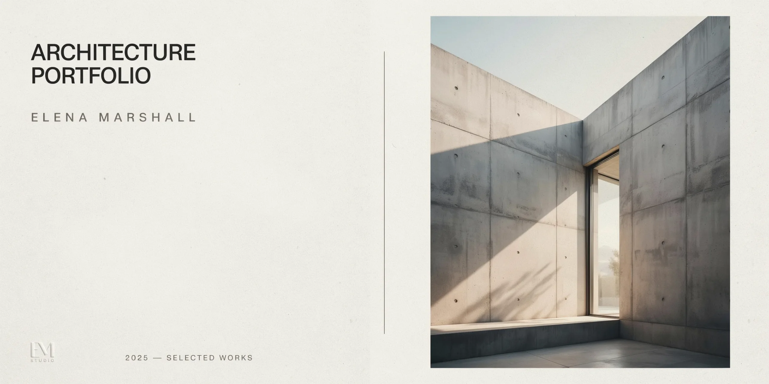
The audience changes what your cover should do. A firm sorting through applicants wants to see polish, employability, and a quick sense of your strongest project type, while a graduate admissions committee is reading for design thinking, process, and potential. Those different priorities justify slightly different covers even when the underlying work is the same.
For a job application, treat the cover as part of a tight package with your CV and cover letter. Because the sample portfolio sent to firms is often only three to five pages, the cover and your first project carry disproportionate weight. Keeping contact details on the cover is sensible here, since a hiring manager may want to reach you without hunting through attachments. If you are assembling that full application, our architecture CV guide covers how the cover, resume, and letter should speak with one visual voice.
For a graduate or M.Arch application, schools frequently publish explicit formatting rules, and following them is part of the test. Syracuse, for example, asks for a front cover showing only the applicant’s name, heavier paper stock, and a single font throughout. Read each program’s portfolio brief before designing your cover, because a beautiful page that ignores stated requirements signals that you did not read the instructions. Programs and their expectations are compared in our architecture grad school guide.
💡 Pro Tip
Build one master cover and create lightweight variants rather than redesigning from scratch for each submission. Keep your name, type system, and grid fixed, then swap only the title line and contact block per audience. This keeps your visual identity consistent across firms and schools while letting you tailor the framing in minutes.
Cover page examples that work, and why
Looking at real approaches clarifies the principles. The most reliable examples share a common trait: they edit aggressively and trust a single idea to carry the page.
- The quiet type cover: a name in a medium-weight sans-serif, centered or set to a left margin, on a near-white field. It works because it implies the applicant has nothing to overcompensate for.
- The fragment cover: a cropped detail of a plan, section, or model occupying part of the page, with type set in the negative space. It works because it previews craft without revealing everything.
- The full-bleed hero: one resolved render or photograph filling the page with reversed-out type. It works only when the image is genuinely excellent, which is why it is the least forgiving choice.
Notice that none of these rely on decoration, gradients, or stock graphics. The strongest covers borrow their authority from the discipline itself: clean geometry, considered spacing, and confident restraint. Browsing curated examples of common portfolio mistakes can help you internalize these patterns before you commit to your own layout.
A cover page is judged in about two seconds, and it is hard to judge your own. Upload your portfolio and see how the cover and the first spread land on a reviewer.
Score my portfolio free →A practical cover page checklist
Before you finalize your cover, run through this quick checklist to catch the issues reviewers notice most.
- Is your full name the clear visual anchor and easy to read at a glance?
- Have you limited yourself to one or two typefaces with deliberate size and weight contrast?
- Does the cover match the grid, palette, and tone of your interior pages?
- If you used an image, is it your strongest, highest-resolution work?
- Have you removed clutter such as GPA, course numbers, and excess credentials?
- Did you proofread your name, title, and contact details for typos?
- For print, is the file 300 DPI with proper bleed; for digital, is the PDF crisp on screen?
Frequently asked questions
Should an architecture portfolio cover page include contact information?
It depends on context. For digital portfolios and job applications, adding email and a portfolio URL makes the cover a useful standalone page. For printed academic portfolios, many schools prefer the front cover to show only your name, with contact details on the back. Match the convention of your audience.
What font is best for an architecture portfolio cover?
There is no mandatory font, but clean sans-serifs such as Helvetica, Akzidenz-Grotesk, or a geometric grotesque are popular for a contemporary architectural feel. Use a single typeface at varying weights for hierarchy, and keep it consistent with the rest of the document.
Do I need an image on my cover page?
No. A type-only cover with generous white space is a timeless, low-risk choice. If you do add an image, use your single strongest, highest-resolution piece, since a weak image on the cover undercuts the work inside.
What size should an architecture portfolio cover be?
Most printed architecture portfolios use A3 or A4, while square formats such as 10×10 inches are also common in academic settings. Whatever you choose, keep the cover dimensions identical to the interior pages so the document feels unified.
Bottom Line: Your architecture portfolio cover page should communicate design judgment through restraint, not decoration. Lead with your name, hold to one or two typefaces, match the interior layout, and choose silence or a single strong visual over clutter. The cover that looks effortless is usually the one that was edited the most.

