Architecture portfolio size is the page dimension, orientation and file weight you commit to before you place a single drawing. Most application portfolios land on A3 landscape or US Letter landscape at under 25 MB, because that is what screens and upload forms accept. The format decision constrains every layout choice after it.
Almost every portfolio guide starts with what to put in the book. Fewer address the question that has to be settled first. How big is the page, which way does it turn, and how heavy is the file allowed to be. Get this wrong and you will rebuild the whole document three weeks before a deadline. The upload form rejects 38 MB, or your spreads collapse into unreadable single pages on a reviewer’s laptop.
This is not a taste question. It is a production question with real constraints published by the people who receive your file, and those constraints are easy to look up before you start.
What is the standard architecture portfolio size?
There is no single standard. The closest thing to a default in architecture is A3 landscape, 420 × 297 mm, followed by US Letter landscape at 11 × 8.5 inches for North American applications. Both give you a wide page that holds a plan and a short caption without shrinking the drawing.
What matters more than the number is that schools and firms mostly refuse to set one. The Rochester Institute of Technology states it plainly. Its graduate portfolio requirements read: “There are no requirements for portfolio page dimensions and orientation; these choices are up to each applicant.” The University of Notre Dame’s architecture admissions page takes the same position on length, allowing “no minimum or maximum pages or images.”
That freedom is not a kindness. It means the format itself is read as a decision you made. That is why it sits inside Production Quality in a portfolio review rather than being treated as a technicality.
🔢 Quick Numbers
- 10.0 MB maximum PDF size for graduate portfolios, with roughly 20 pages and 5 to 10 projects suggested (RIT graduate portfolio requirements)
- 25 MB maximum, formatted for on-screen viewing and avoiding double-spread layouts (UT Austin School of Architecture, M.Arch instructions)
- 25 MB maximum with no page or image limit, but hand-done graphics required (University of Notre Dame School of Architecture admissions)
Three schools, three different ceilings. The lesson is not to memorise a number but to read the form before you set the document. A 24 MB file that passes at Texas fails at RIT by more than double.
Landscape or portrait: which orientation should you use?
Use landscape if the file will be read on a screen, which now covers most first reviews. Use portrait only when the work itself is vertical, such as tall sections, elevations of a tower, or a body of work built around single-image plates.
The reason is mechanical. A laptop screen is wider than it is tall, so a portrait page either shrinks to fit the height or forces the reader to scroll through every page twice. A landscape page fills the same screen and leaves the reviewer’s eye moving left to right across the drawing, which is how plans and sections are read anyway. The same logic drives the choices in a digital portfolio, where the screen is the only surface.
⚖️ Pros & Cons at a Glance
✔️ Landscape: fills a laptop screen with no scrolling; matches the proportion of plans and site sections; reads well on a shared screen; prints two-up on A4.
✖️ Landscape: wastes space on tall elevations, awkward to print and bind at home, tempts you into spreads that break when the file is viewed one page at a time.
When portrait still makes sense
Portrait holds up for printed books you will hand across a table, for competition boards reformatted into a document, and for work dominated by vertical subject matter. It is also the safer choice if the portfolio doubles as a physical leave-behind, since portrait binds and stands more naturally on a shelf.
What does not hold up is mixing them. A document that turns sideways every fourth page forces the reader to rotate a laptop or fight the PDF viewer. That friction gets attributed to you rather than to the software.
The spread trap
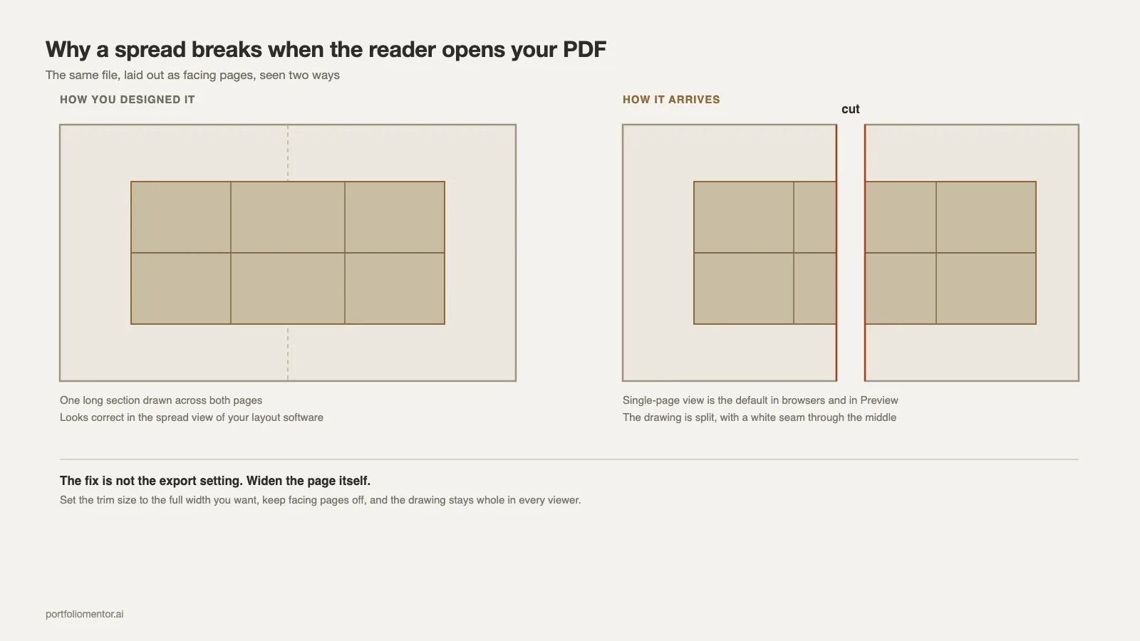
Designing in facing pages feels right because it mirrors a printed book. It breaks the moment a reviewer opens your PDF in single-page view, which is the default in most browsers and in Preview on macOS. A drawing that crossed the gutter now sits split across two screens with a white seam through the middle.
UT Austin names this directly, asking applicants to format “for on-screen viewing (avoid a double-spread layout).” If you want the width of a spread, set the page itself wider instead of stitching two pages together. Setting that up correctly is covered step by step in the InDesign portfolio walkthrough.
⚠️ Common Mistake to Avoid
Setting up an InDesign document with facing pages on, then exporting as spreads because it looks better in your own viewer. The reviewer opens it single-page, and every drawing you ran across the gutter is cut in half. If you need the wide format, change the page dimensions rather than the export setting, and check the result in a browser before you send it.
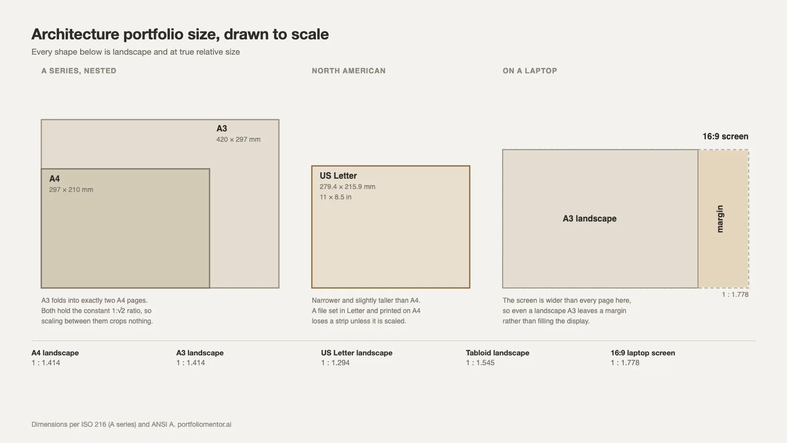
A3, A4 and US Letter: how the page sizes compare
The A series is defined by ISO 216 and holds a constant 1:√2 proportion, which is why A3 folds exactly into two A4 pages with nothing cropped. US Letter does not share that geometry, so a document set in Letter and printed on A4 loses a strip at one edge unless it is scaled.
📐 Technical Note
ISO 216 A-series: A4 is 210 × 297 mm, A3 is 297 × 420 mm, each step doubling the area at a fixed 1:1.414 ratio. US Letter is 8.5 × 11 in (215.9 × 279.4 mm) at a 1:1.294 ratio, and Tabloid is 11 × 17 in. A 16:9 laptop screen sits at 1:1.778, wider than all of them. That is why a landscape A3 page still leaves margins on screen rather than filling it edge to edge.
Practical reading of that table: A3 landscape is the widest common page that still prints cleanly at home on A4, and Letter landscape is its North American equivalent. Most commercial portfolio templates ship in A4 portrait, so check the page before you commit to one. If your reviewers are split across regions, A3 landscape is the safer default because scaling A3 down to Letter crops less than the reverse.
How much should an architecture portfolio file weigh?
Architecture portfolio size is not only a page dimension; it is also a file weight, and the second number fails applications more often than the first. Target 10 MB. That single number clears the strictest published limit in the examples above and leaves room if a firm’s application form caps attachments lower, which many do.
Weight comes almost entirely from raster images. A portfolio at 20 to 30 pages with vector drawings and compressed renders sits comfortably under 10 MB. The same document balloons past 40 MB when renders are placed at full camera resolution and exported without downsampling.
💡 Pro Tip
Export two files from the same document and name them clearly. A screen version downsampled to 150 ppi for uploads and email, and a print version at 300 ppi kept locally. The screen file is what you send everywhere. Reviewers who want the heavy version will ask, and almost none do.
If you are still over the limit after downsampling, the problem is usually page count rather than image quality. Cutting one whole project removes more weight than compressing every image in the book, and it improves Project Selection at the same time. The complete architecture portfolio guide covers how to decide which project leaves.
Page size against page count: the trade nobody names
A larger page lets you put more on each sheet, which shortens the document. A smaller page forces one idea per page, which lengthens it. Both can produce a good book, but only if you pick one and hold it.
The failure case is an A3 landscape portfolio laid out as though it were A5: one drawing floating in the middle of a wide page, repeated for thirty pages. The format promised density and the content did not deliver it, and that gap reads as indecision rather than restraint. Page proportion and the grid you build on it belong to the same decision. Settle portfolio layout and grid structure in the same sitting as the page size.
RIT’s guidance is a useful anchor here: five to ten projects across roughly twenty pages. At A3 landscape that is two to four pages per project. Enough for a site drawing, a plan, a section and one render; not enough for a process dump.
Print and screen need different files
Building both from one document is straightforward if you decide it at setup. The print file carries bleed, crop marks and 300 ppi images. The screen file drops bleed, embeds no crop marks, downsamples to 150 ppi and can carry hyperlinks in the contents page.
Trying to serve both with a single export produces a file that is too heavy to email and too soft to print. Set the document once at the final trim size, then export twice with different presets. Getting both out of one file is also where a common portfolio mistake sits: exporting once and hoping it serves both.
Web portfolios sit outside this entirely. A responsive page has no fixed dimension and reflows to the device, so the page-size question is replaced by image sizing and load time. If the portfolio lives online rather than as a PDF, the rules change from page size to image sizing and load time.
Setting the document up correctly the first time
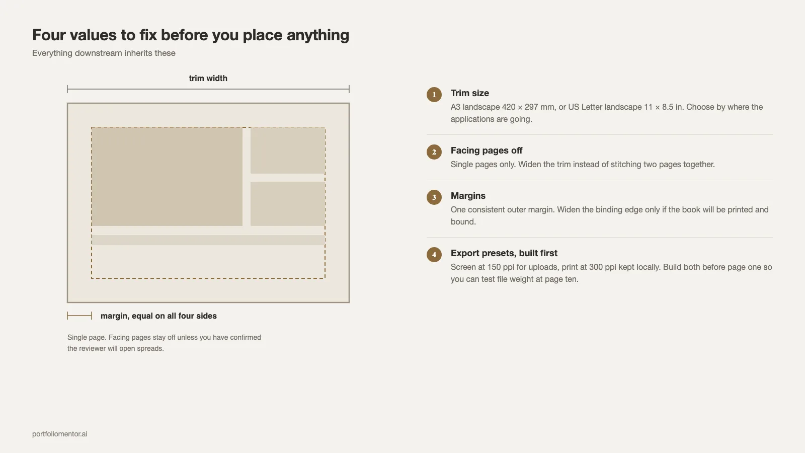
Before placing anything, fix four values and write them somewhere you will see them: trim size, orientation, margin, and target file weight. Everything downstream inherits these.
- Trim size. A3 landscape (420 × 297 mm) or Letter landscape (11 × 8.5 in). Choose by where your applications are going.
- Facing pages off. Single pages only, unless you have confirmed the reviewer will open spreads.
- Margins. A consistent outer margin, wider at the binding edge only if the book will be printed and bound.
- Export presets. Build the 150 ppi screen preset before you start, so you can test file weight at page ten rather than at page forty.
Testing weight early is the part people skip. A portfolio that is 6 MB at ten pages will be roughly 18 MB at thirty. You want to know that while there is still time to change the render export settings.
Format decisions of this kind are one of the ten categories a Portfolio Mentor review scores, alongside Typography and Layout. Reviewers register a mis-sized or mis-weighted file before they register the drawings inside it.
Format by situation
The right answer shifts with who is receiving the file.
Graduate applications. Read the program page first, then set the document. Limits vary from 10 MB to 25 MB across the schools quoted above, and some programs still require hand drawing to be present. Portfolio requirements for applications are handled in more depth in the architecture grad school guide.
Job applications. Send a short landscape PDF under 10 MB and keep the full book as a link. Practices receive these by email and many mail servers still reject attachments above that. Sizing for a first job application is covered in the internship portfolio guide.
Landscape architecture. The wide page earns its keep here more than anywhere, because site plans and long sections are the core drawings. Format conventions specific to that field sit in the landscape architecture portfolio guide.
Starting from a template. Check the template’s page size against your target before you commit, since most commercial files ship in A4 portrait. Finished books at different page sizes can be studied in the portfolio examples collection.
A ten-minute format check before you send
Run this on the exported file, not on the working document.
- Open the PDF in a browser at default zoom. Is every page readable without zooming in?
- Check the file size against the specific limit on the form you are submitting to, not against a remembered number.
- Scroll through in single-page view. Does any drawing cross a page break?
- Confirm the orientation is consistent from cover to last page.
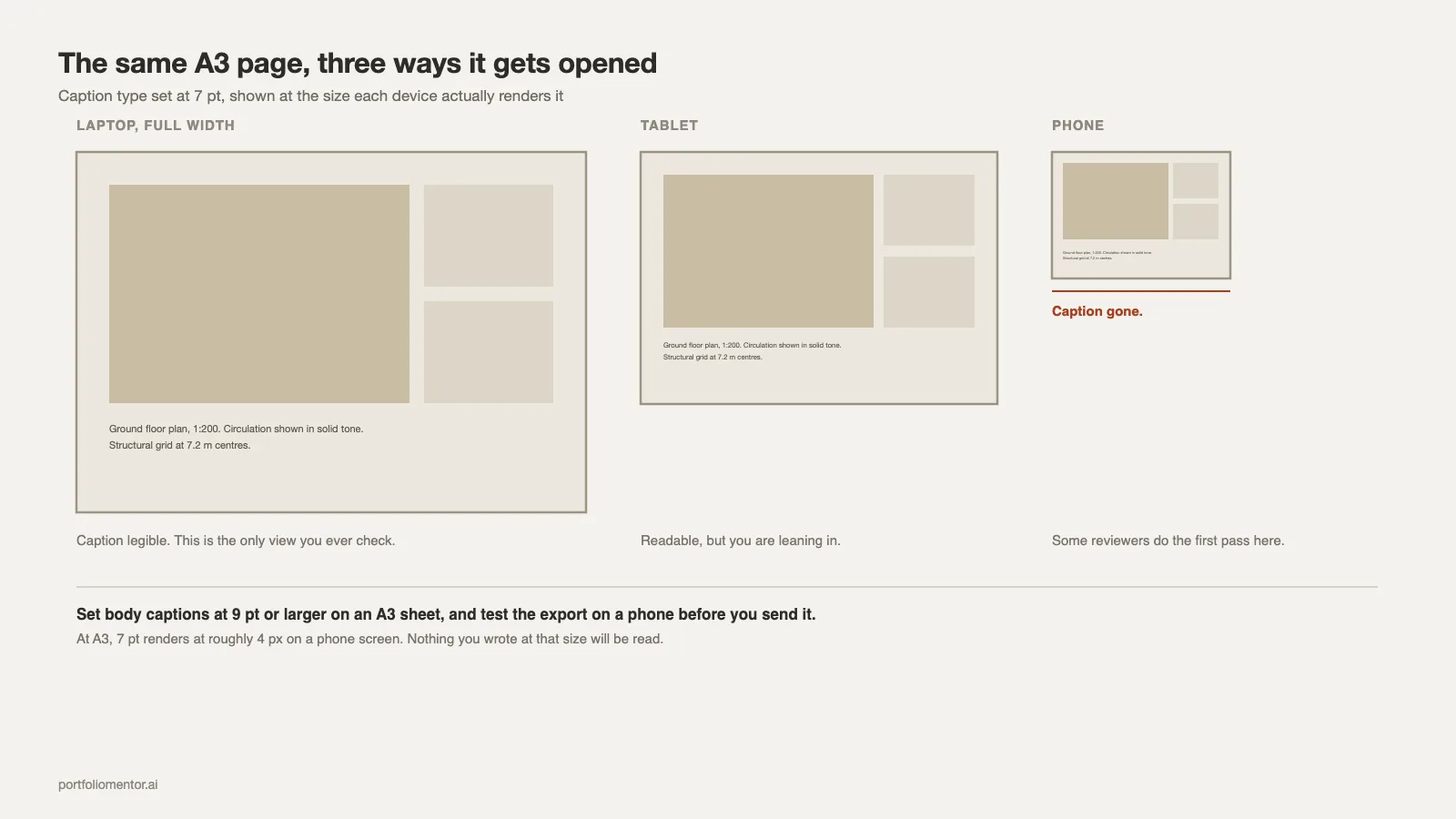
- Open it on a phone. Captions at 7 pt will disappear, and some reviewers do a first pass on a phone.
The cover is the one page that carries the format decision visually, since it sets the proportion a reader sees before anything else. Options for handling it are in the portfolio cover page guide.
Where this leaves you
A workable architecture portfolio size, stated as one line: A3 landscape under 10 MB, single pages, one orientation throughout, two exports from one document. That combination satisfies every published requirement quoted here and survives being opened on a laptop, a phone or a printer.
The format is not where a portfolio is won. It is where one gets rejected before the work is looked at, and unlike the work itself, it takes an afternoon to get right.