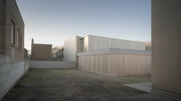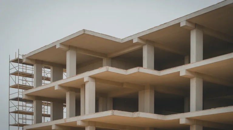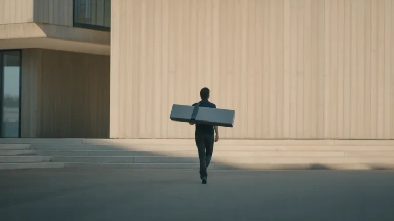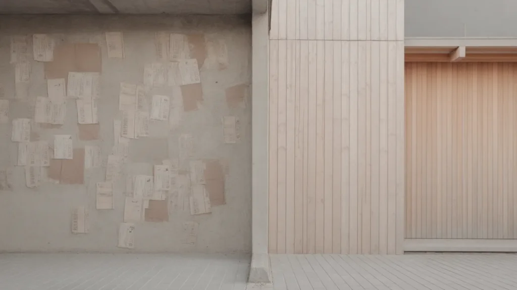
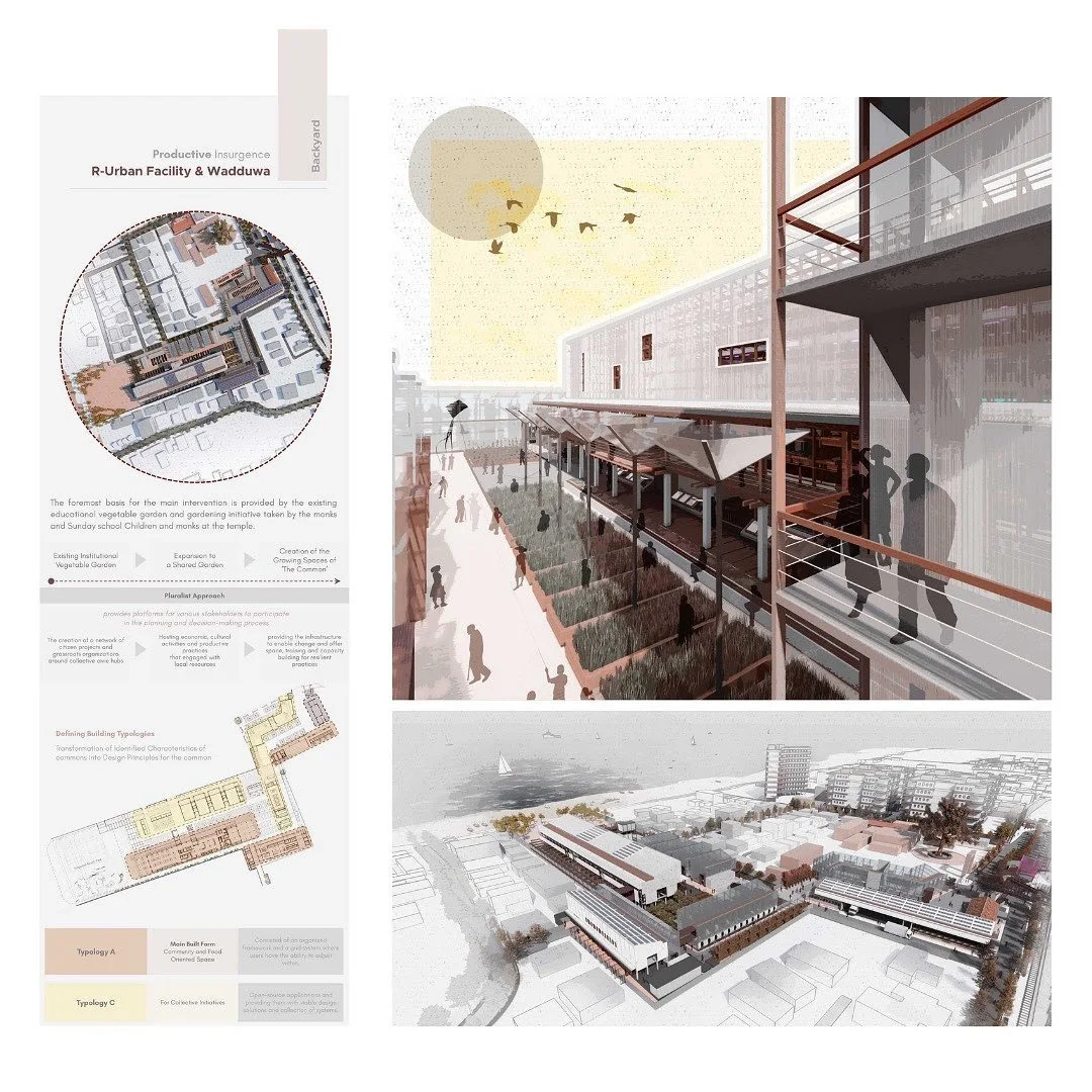
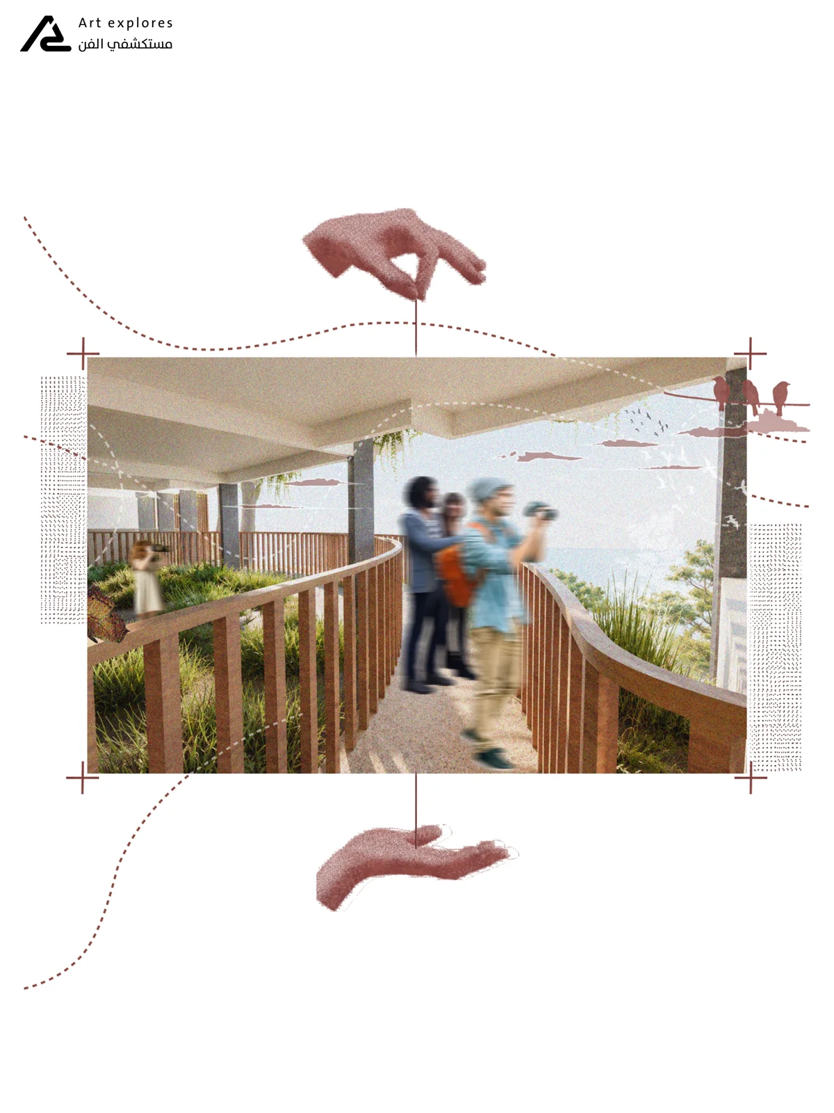
Architecture collage assembles photographs, textures, drawings and cut-out figures into a single image that argues for atmosphere rather than describing geometry. It borrows a hundred-year-old art technique and works in a portfolio when it carries an idea the render cannot, and fails when it is decoration.
Architecture collage went from niche to ubiquitous in about a decade. Reviewers now see collages in most student portfolios, so the bar has moved. An image that once signalled a distinct sensibility now signals that you follow the same accounts as everyone else, unless it is doing specific work.
This guide covers where the technique came from and what it can show that other drawings cannot. It also covers how to build one that holds up at portfolio size, and when to leave it out.
What is architecture collage?
It is the application of collage and photomontage to architectural representation. Tate defines collage as a technique “in which pieces of paper, photographs, fabric and other ephemera are arranged and stuck down onto a supporting surface”. The term comes from the French papiers collés. Photomontage is the narrower case: “a collage constructed from photographs”.
In architecture the support is usually digital and the cut pieces are usually a mix of photographs, scanned texture, orthographic line work and figures. What carries over from the art tradition is the visible seam: collage does not hide that it is assembled, and that honesty is the point.
📌 Did You Know?
Photomontage was first used by dadaists in 1915 as a form of protest against the First World War. It has carried political argument ever since, from Rodchenko’s constructivist work in 1923 to Peter Kennard’s photomontages of the 1970s to 1990s (Tate). The architectural version inherits that capacity for argument, which is why a collage reads as a position while a render reads as a proposal.
When does a collage beat a render?
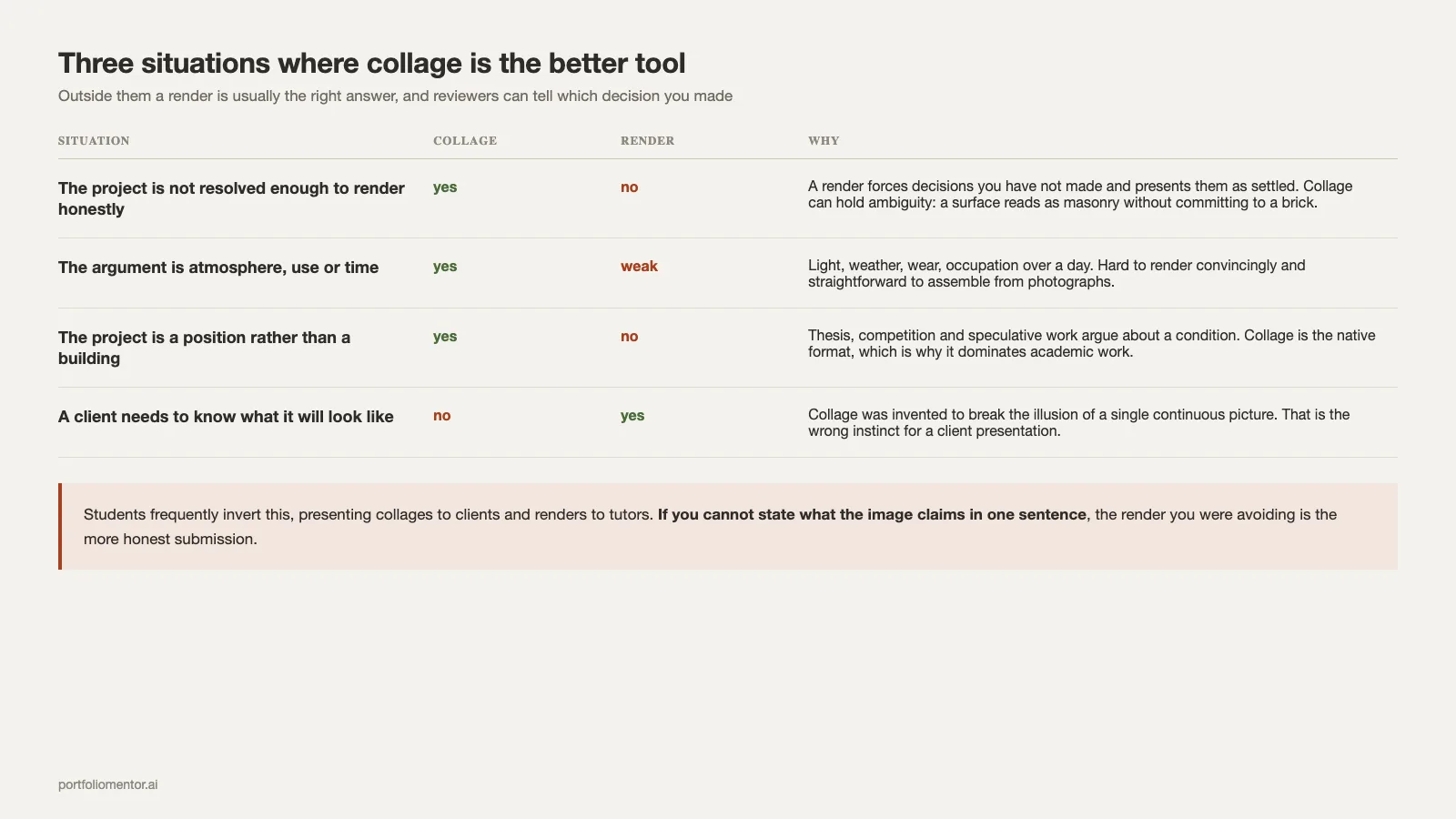
Three situations, and outside them a render is usually the better tool.
The project is not resolved enough to render honestly
Early-stage work has undecided materials and unresolved details. A render forces decisions you have not made and then presents them as settled. A collage can hold ambiguity: a surface can read as masonry without committing to a brick, and the reviewer understands the register.
The argument is about atmosphere, use or time
Light, weather, wear, occupation over a day. These are hard to render convincingly and straightforward to assemble from photographs. A collage showing a space used differently in three seasons makes a claim a single render cannot.
The project is a position rather than a building
Thesis work, competition entries and speculative projects argue about a condition rather than proposing an object. That is why collage appears more in an academic portfolio than a professional one. Collage is the native format for that, which is why it dominates in academic work and appears less in practice.
⚠️ Common Mistake to Avoid
Using collage to cover an unresolved project rather than to argue about it. Reviewers distinguish these immediately. A collage with nothing to say defaults to the same visual habits: a pale flat elevation, three cut-out people from the same free pack, a bird, and a gradient sky. If you cannot state what the image claims in one sentence, the render you were avoiding is the more honest submission.
A short lineage worth knowing
Knowing where architecture collage came from changes how you use it, and it gives you something to say when an interviewer asks why the image looks the way it does.
Collage entered art practice in the early twentieth century, with Picasso’s Bottle of Vieux Marc, Glass, Guitar and Newspaper from 1913 among the works Tate cites as early examples. Photomontage followed in 1915 in dadaist hands, with Raoul Hausmann’s The Art Critic made in 1919 to 1920 and Rodchenko experimenting with the technique from 1923. The line runs on through Kurt Schwitters, Max Ernst, Eduardo Paolozzi, Richard Hamilton and Robert Rauschenberg, across Dada, Surrealism and Pop Art.
Two things in that history matter for architecture. The technique was invented to break the illusion of a single continuous picture, and it was used from the start to make arguments about the world rather than to depict it accurately. Both remain true of a good architectural collage, and neither is true of a render.
That is why collage is the wrong tool for a client presentation, where someone needs to know what a building will look like. It is the right tool for a thesis, where the point is what a building would mean. Students frequently invert this, presenting collages to clients and renders to tutors.
Why the format spread so fast
Two practical reasons rather than a stylistic one. Collage is faster to produce than a photorealistic render and does not require a resolved model, which suits a studio deadline. And it degrades gracefully: a mediocre collage looks like a choice, while a mediocre render looks like a failure. That asymmetry, not fashion, explains most of its adoption in student work.
It also explains the current problem. When a format is chosen because it is forgiving, the average example carries no argument, and reviewers adjust their expectations accordingly. The way back is specificity, which is a content decision rather than a technical one.
Building one that holds together
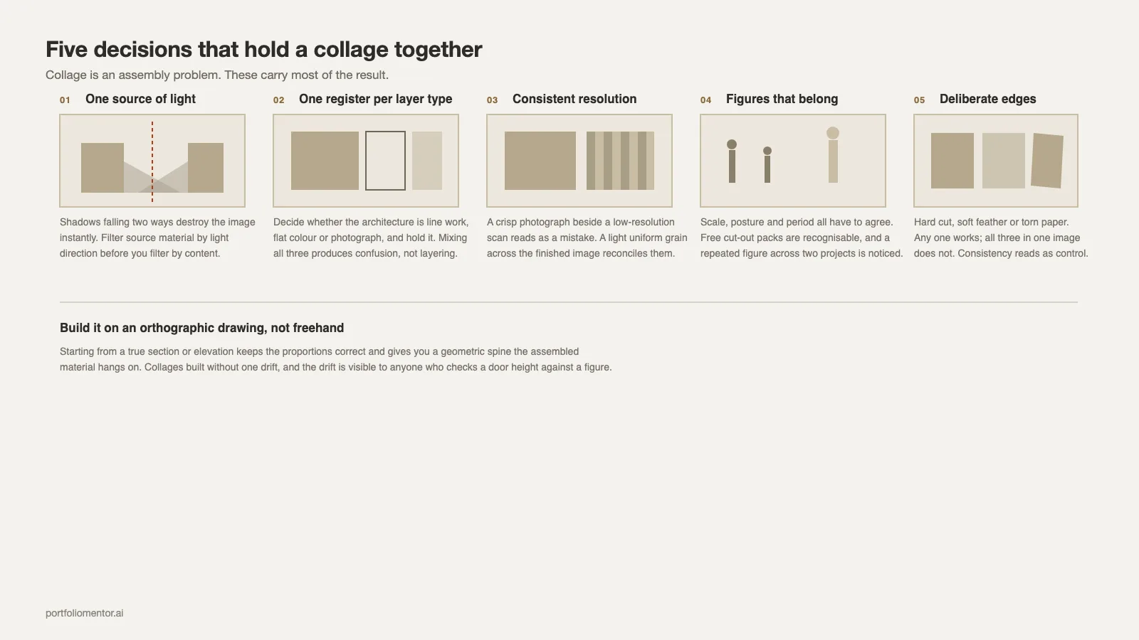
Collage is an assembly problem. Five decisions carry most of the result.
1. One source of light
Every element you cut in carries the light of the photograph it came from. Figures lit from the left dropped into a scene lit from the right destroy the image instantly, and this is the single most common technical failure. Filter your source material by light direction before you filter it by content.
2. One graphic register per layer type
Decide whether the architecture is line work, flat colour or photograph, and hold it across the whole book, the way a consistent layout system holds type and grid. Mixing a photographic wall with a line-drawn floor and a flat-colour ceiling in the same image produces confusion rather than layering.
3. Consistent resolution and grain
A crisp modern photograph next to a scanned archive image at low resolution reads as a mistake unless the difference is clearly deliberate and repeated. Adding a light uniform grain across the finished image is the usual way to reconcile mixed sources.
4. Figures that belong
Scale, posture and period all have to agree with the scene. The free cut-out packs are recognisable to anyone who has reviewed portfolios for a season. A repeated figure across two projects is one of the details reviewers notice.
5. Deliberate edges
Hard cut, soft feather or torn paper. Any of them works; all three in one image does not. The edge treatment is the strongest stylistic signal in a collage, and consistency across a project reads as control.
💡 Pro Tip
Build the collage on top of an orthographic drawing rather than freehand. Starting from a true section or elevation keeps the proportions correct and gives you a geometric spine the assembled material hangs on. Collages built without one drift, and the drift is visible to anyone who checks a door height against a figure.
Where do the images come from, and who owns them?
Source material carries licences. Photographs from stock sites, museum collections and other architects’ projects all have terms, and portfolios are published documents once they go on a personal site or into an application system.
Practical position: use your own photographs wherever possible, use openly licensed material where you cannot, and keep a list of what came from where. A Creative Commons licence such as CC BY works for portfolio use. It “enables reusers to distribute, remix, adapt, and build upon the material in any medium or format, so long as attribution is given to the creator”. If a collage relies on a recognisable photograph by a named photographer, credit it in the caption. This costs nothing and removes a category of problem that occasionally becomes real when a portfolio is published online.
Using another architect’s rendering or drawing as a base layer is a different matter and should simply not happen in a portfolio that represents your work.
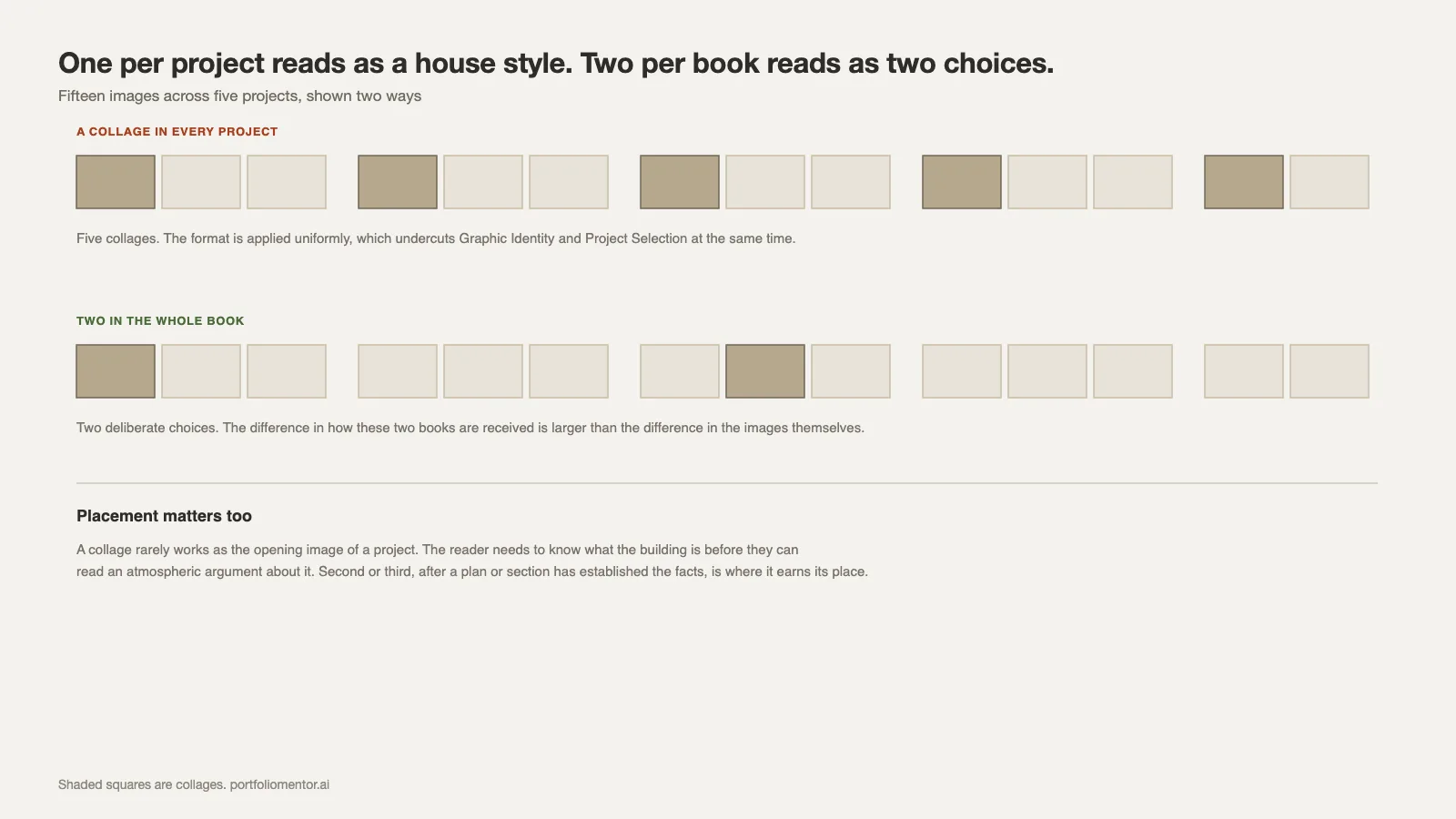
How many belong in a portfolio
One per project, and not in every project.
A book where every project is represented by a collage reads as a house style applied uniformly, which undercuts Project Selection and Graphic Identity at the same time. A book with two collages among fifteen images reads as two deliberate choices. The difference in how those two books are received is larger than the difference in the images themselves.
Placement matters too. A collage rarely works as the opening image of a project, because the reader needs to know what the building is before they can read an atmospheric argument about it. Second or third, after a plan or section has established the facts, is where it earns its place. Sequencing within a spread is covered in portfolio layout and design, and finished books that handle the balance well can be read in published portfolio examples.
What a reviewer is actually scoring
Collage sits across two of the ten categories in a portfolio review. Graphic Identity, because it is the most style-bearing image type in the book; Concept & Narrative, because it is where an argument is usually made explicit.
What separates a strong collage from a competent one in that reading is not technique. It is whether the image tells the reviewer something the other drawings did not. An image that repeats what the section already showed, with more texture, scores as production effort without content.
The related failure is a book in which the collages are the only images with any care in them, which suggests the candidate enjoys image-making and avoids drawing. That pattern is recognisable and is discussed among the other recurring problems in common architecture portfolio mistakes.
Practical production notes
- Work large, place small. Build at final print size or larger, then downsample on export. Collages assembled at screen resolution fall apart in print.
- Keep layers grouped by source type. Architecture, figures, vegetation, sky, grain. Reworking becomes possible; flattened files become disposable.
- Export flattened for the portfolio. Layered files inflate PDF size fast, and application forms have real limits.
- Check it in greyscale. If the composition collapses without colour, the structure was carried by hue rather than by value, and it will not survive printing.
File weight is worth watching here specifically, because collages are the heaviest images most portfolios contain. Two or three at full resolution can double a document. The export settings that keep a book under an application limit are covered in the InDesign portfolio walkthrough, and the wider selection question in the architecture portfolio guide.
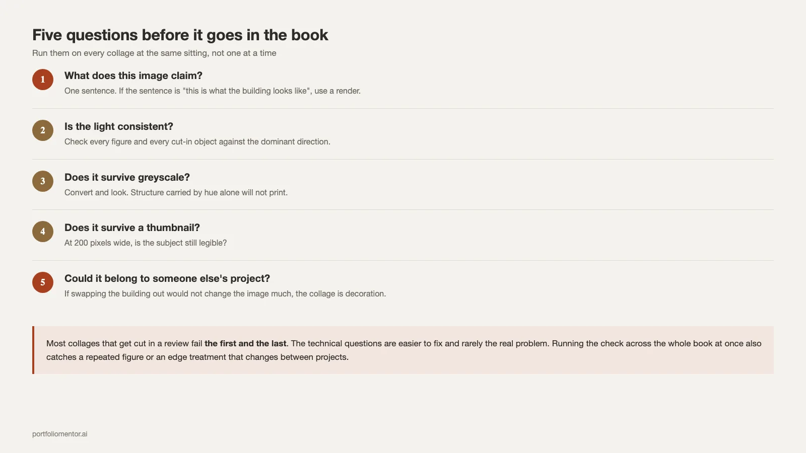
A quick self-check before it goes in the book
Five questions, answered honestly, catch almost everything.
- What does this image claim? One sentence. If the sentence is “this is what the building looks like”, use a render.
- Is the light consistent? Check every figure and every cut-in object against the dominant direction.
- Does it survive greyscale? Convert and look. Structure carried by hue alone will not print.
- Does it survive a thumbnail? At 200 pixels wide, is the subject still legible?
- Could it belong to someone else’s project? If swapping the building out would not change the image much, the collage is decoration.
Most collages that get cut in a review fail the first and the last. The technical questions are easier to fix and rarely the real problem.
Run the check on every collage in the book at the same sitting rather than one at a time. Problems that are invisible in a single image, such as a repeated figure or an edge treatment that changes between projects, only appear when the images sit side by side.
The short version
Collage is an argument format borrowed from a tradition of argument. Use it when the project is unresolved, atmospheric or positional. Build it on an orthographic base with one light direction and one edge treatment, credit your sources, and include one or two per book rather than one per project. If you cannot say in a sentence what the image claims, draw the section instead.