
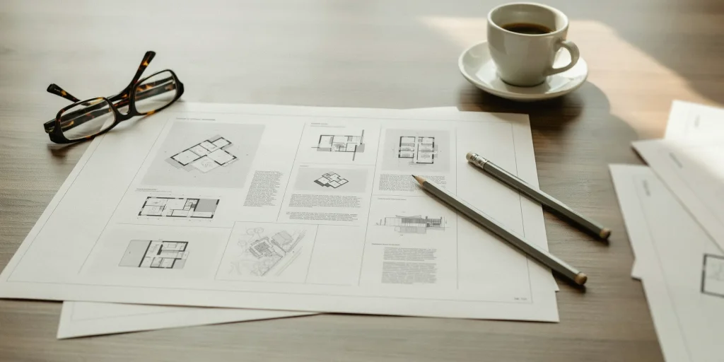
An InDesign architecture portfolio starts with a correctly sized document, a consistent column grid built on parent pages, and clean export presets for both print and screen. Getting these three foundations right keeps your drawings sharp, your layout aligned across every spread, and your file small enough for firms to actually open.
See archdaily.com.
Most students treat InDesign as a glorified image-placing tool, then wonder why their pages drift out of alignment and their final PDF balloons past 50 MB. The fix is structural. Before you place a single plan or render, you set up the document, the grid system, and the master pages that govern every page after. This guide walks through that setup step by step, then covers image handling and the export settings that separate a portfolio that reads as professional from one that gets closed in the first ten seconds.
How do you set up an InDesign document for an architecture portfolio?
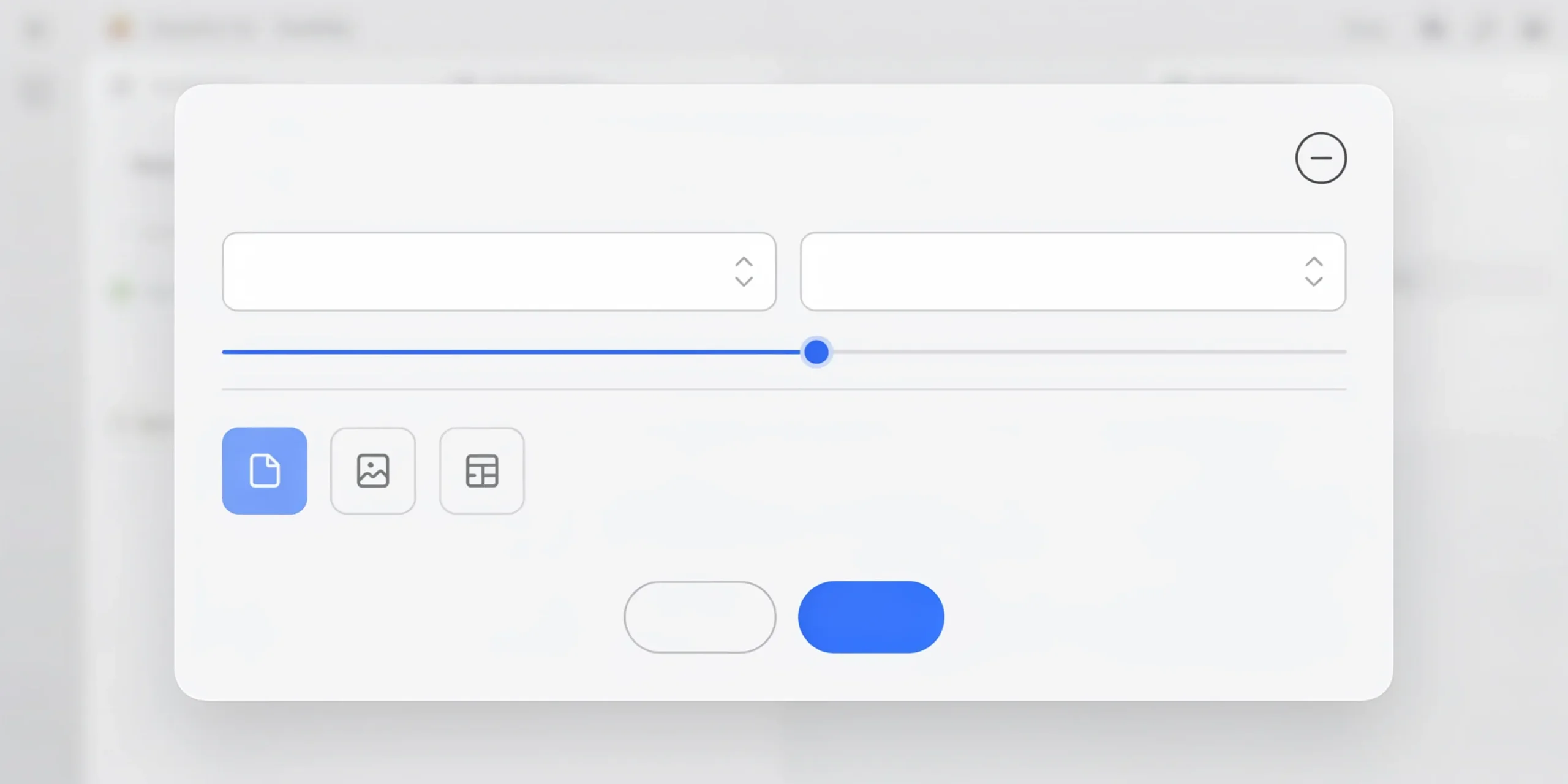
Start with File > New > Document. The first decisions you make here are hard to change later, so think about output before you click Create. The two most common formats for an architecture portfolio are A4 landscape (297 x 210 mm) for digital review and A3 landscape (420 x 297 mm) for print or large-firm submissions. Landscape suits architectural drawings because plans, sections, and wide renderings sit naturally across a horizontal spread.
Set your units first under InDesign > Settings > Units & Increments. Architecture portfolios are usually built in millimeters, though US firms often expect inches. Then in the New Document dialog, enable Facing Pages if you want true spreads, set margins, and add a bleed of 3 mm (0.125 in) on all four sides if anything in your design runs to the page edge. Without bleed, full-bleed images print with thin white slivers along the trim.
A practical starting point for margins is 15 to 20 mm on the outside, top, and bottom, with a slightly wider inside margin of 20 to 25 mm to protect content from disappearing into the binding gutter. If you are unsure how many pages you need or what aspect ratio firms expect, our architecture portfolio templates give you ready-made document setups calibrated to common submission standards.
📐 Technical Note
For digital submission keep the document in RGB color (Edit > Transparency Blend Space > Document RGB), since screens and most firm reviews are screen-based. Switch to CMYK only when a printer specifically requests it. Place raster images at 300 PPI at final print size; anything below 150 PPI will look soft once enlarged on the page.
What grid system should an architecture portfolio use?
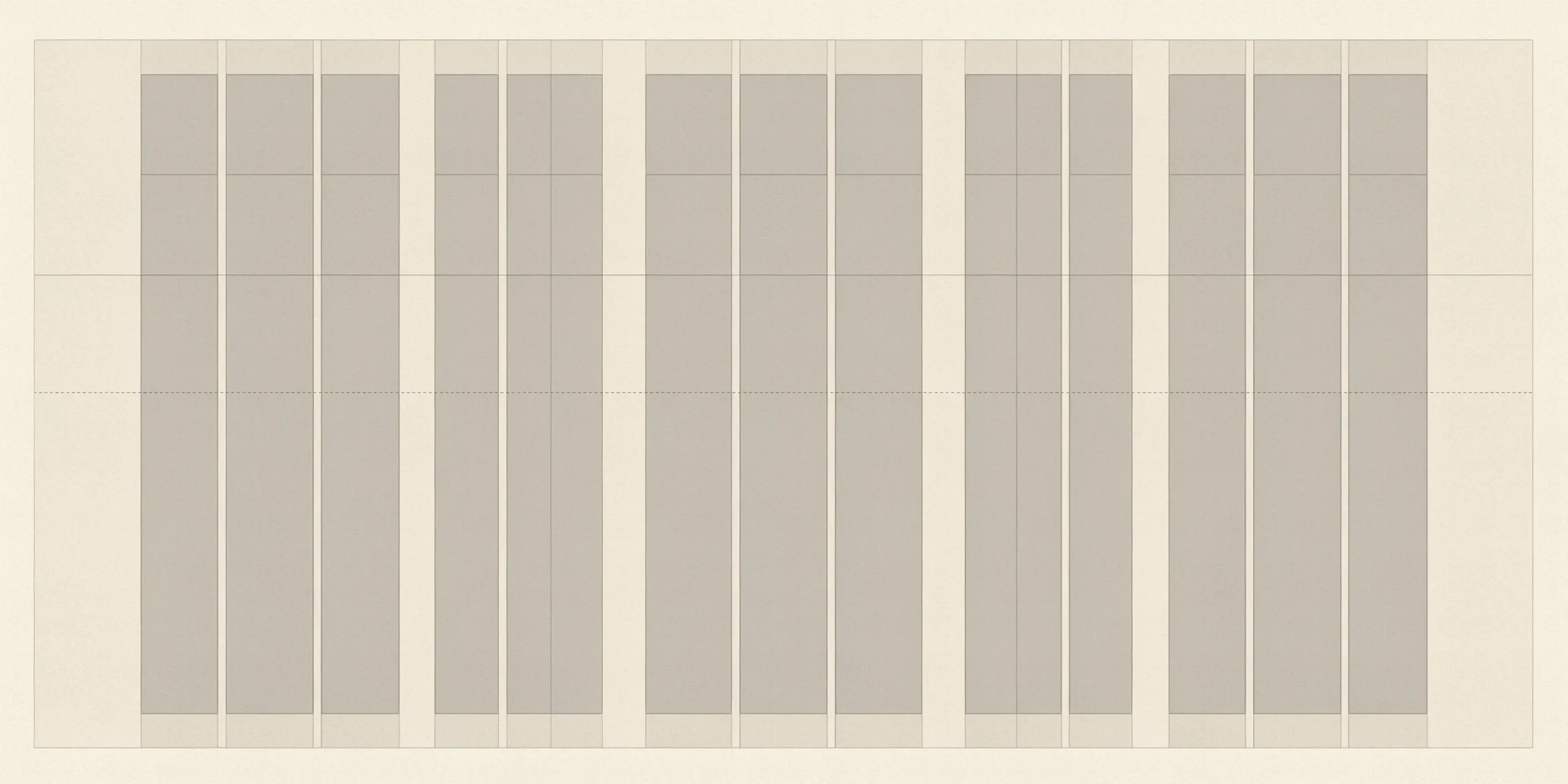
A column grid is what holds a portfolio together visually. The 12-column grid is the standard choice because 12 divides evenly into halves, thirds, quarters, and sixths, which gives you flexible layout options without redrawing guides for every page. You set it under Layout > Margins and Columns, entering 12 columns with a gutter of 4 to 5 mm between them.
On top of the column grid, add a baseline grid so that captions, body text, and project descriptions align across the page and across spreads. Adobe’s documentation describes the baseline grid as resembling ruled notebook paper, used specifically to line up columns of text. Set it under InDesign > Settings > Grids, with the increment matching your body text leading (for example, 14 pt leading means a 14 pt baseline increment). When text snaps to this grid, your layout reads as deliberate rather than improvised.
💡 Pro Tip
A common move in reviewed portfolios is to keep one consistent margin band reserved for project titles and page numbers across every spread. Pick a fixed location, such as the bottom-left two columns, and never break it. Reviewers scan dozens of portfolios in a sitting, and that repeated anchor point makes your work feel edited and intentional.
How many columns and how much white space?

The grid defines structure, but white space defines confidence. Drawings need room to breathe, so resist filling every column. A single full-bleed section drawing on an otherwise empty spread often reads stronger than four cramped images. Use the 12 columns as a framework for deciding image widths: a hero image might span 8 columns while its caption sits in the remaining 4. Treat the grid as a guide you can deliberately break, not a cage.
Why are master pages essential for portfolio consistency?
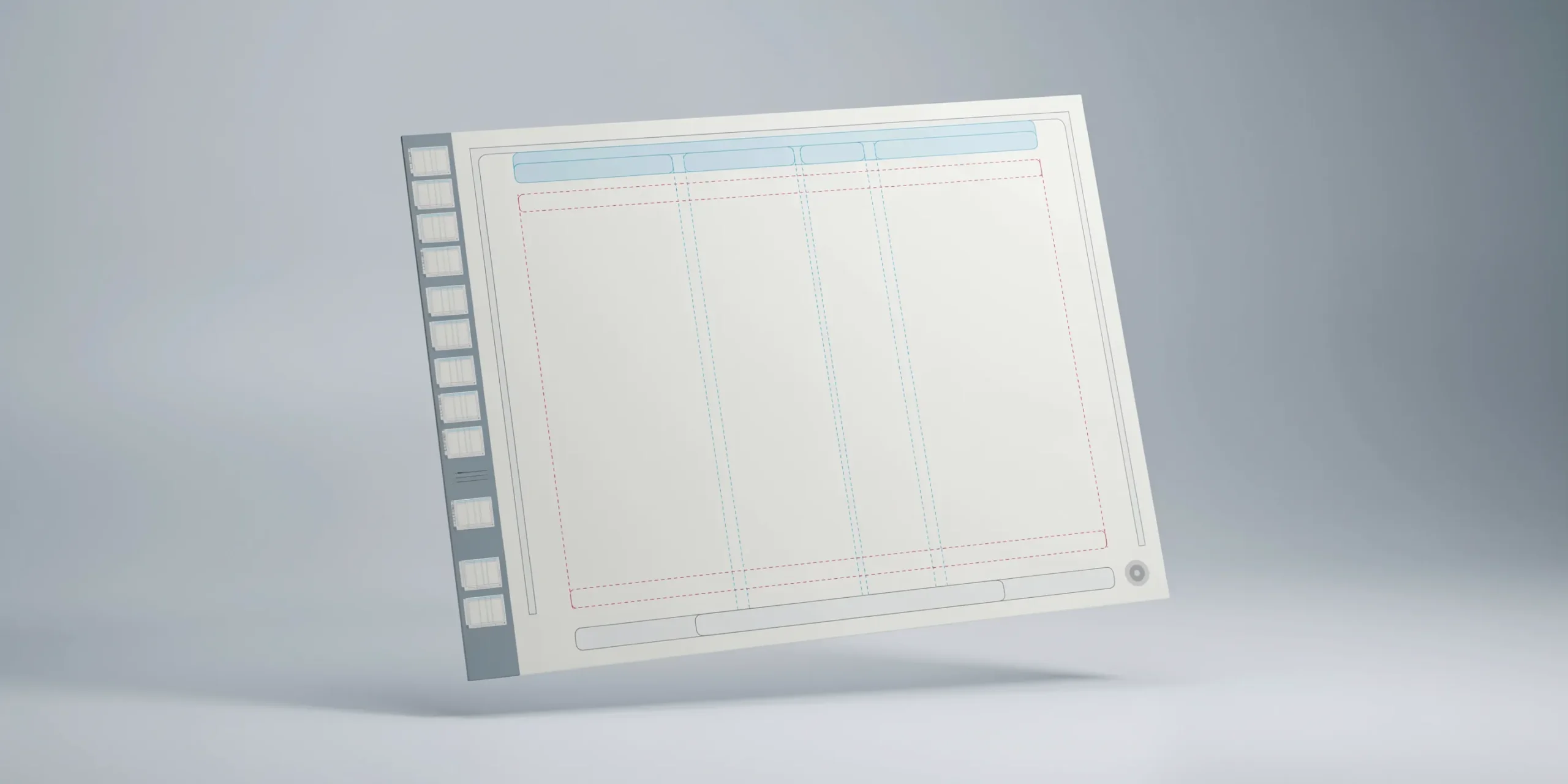
Master pages, now called parent pages in current InDesign versions, are reusable templates applied across many pages at once. Anything you place on a parent (column guides, page numbers, a thin footer rule, your name) appears automatically on every page that uses it. Adobe notes that if you change column or margin settings on a parent, objects on the affected pages can adjust to the new layout automatically. That single feature saves hours when you decide to widen a margin halfway through a 40-page document.
Build at least two or three parent pages: one for full-bleed image spreads, one for text-plus-drawing pages, and one for project divider pages. Add automatic page numbering by inserting a text frame and choosing Type > Insert Special Character > Markers > Current Page Number. To edit a parent-page element on a specific page, Command/Ctrl-Shift-click to override it locally without detaching the whole page from its parent.
⚠️ Common Mistake to Avoid
Placing page numbers, titles, and footer rules manually on each page instead of on a parent. It looks identical at first, but the moment you reorder, insert, or delete a project spread, every manual element falls out of sequence and you spend an evening fixing alignment by hand. Put repeating elements on parent pages from day one.
How should you handle images and linked files?
Never copy and paste images directly into InDesign. Use File > Place so each image stays linked to its source file. Linked images keep your INDD file light and let you re-edit a render in Photoshop without redoing the layout. The Links panel (Window > Links) shows every placed file and flags any that are missing or modified, which matters when you move the project between machines.
Keep all images in a single subfolder next to your INDD file, and when you finish, run File > Package. This collects the document, every linked image, and all fonts into one folder, so nothing breaks when you open the file elsewhere or hand it to a printer. For guidance on which drawings and renders actually belong in the layout, study real architecture portfolio mistakes before you commit a project to a spread.
💡 Pro Tip
Before placing a large TIFF or PNG render, flatten and resize it in Photoshop to roughly its on-page dimensions at 300 PPI. Placing a 6000 px render into a frame that displays it at 1500 px wastes file weight and slows InDesign’s preview. Resizing at the source is the single biggest factor in keeping your final PDF small.
InDesign handles the document; a growing number of tasks around it — upscaling a render, cleaning a scan, drafting caption text — are now faster with software built for the job. Our roundup of AI tools for architects covers which ones are worth adding to a portfolio workflow and which are noise.
What are the best InDesign export settings for a portfolio?
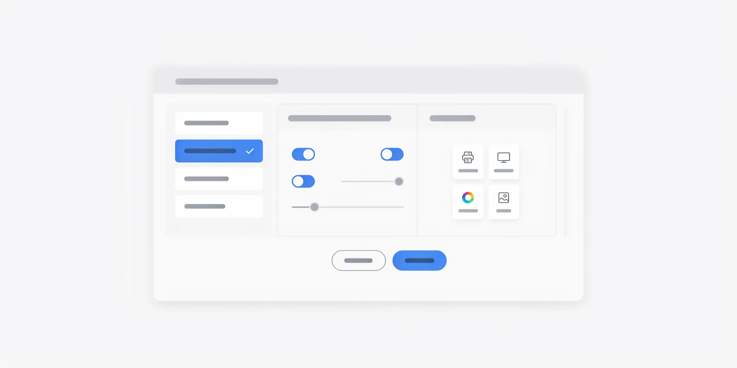
Export choices depend entirely on where the portfolio goes. A print submission and a 5 MB email attachment need different presets. InDesign offers two PDF export paths: File > Export > Adobe PDF (Print) for static, high-quality output, and Adobe PDF (Interactive) when you want clickable links or page transitions. For nearly every architecture portfolio sent to a firm or school, the Print path with adjusted compression is the right tool.
Which PDF preset for print versus screen?
The table below maps the common scenarios. The key trade-off is resolution against file size: a printer wants 300 PPI and Press Quality, while a firm reviewing on screen prefers a file under 10 MB at 144 to 150 PPI.
| Use Case | Preset | Resolution | Target Size |
|---|---|---|---|
| Email or online application | High Quality Print, custom compression | 144 to 150 PPI | Under 10 MB |
| Professional print or binding | Press Quality | 300 PPI | Large, quality first |
| Clickable digital portfolio | Adobe PDF (Interactive) | Up to 300 PPI | Moderate |
| Quick preview share | Smallest File Size (avoid for final) | 100 PPI | Very small |
For the email version, start from the High Quality Print preset, then open the Compression tab and set color and grayscale images to Bicubic Downsampling at 150 PPI with JPEG Maximum image quality. Avoid the Smallest File Size preset for anything you submit, since it crushes images to 100 PPI and your line drawings turn fuzzy. If your exported file is still too heavy, run it through Acrobat’s Save As Other > Reduced Size PDF, or compress source renders before placing them. The official Adobe InDesign export documentation details every option in the PDF dialog.
📐 Technical Note
Resolution above the page need is wasted weight. A 300 PPI image displayed at half size effectively carries 600 PPI of data the viewer never sees. Set the Compression downsampling threshold slightly above your target (for example, downsample to 150 PPI for images above 225 PPI) so InDesign only shrinks files that exceed what the page actually requires.
Should you publish online as well?
Many architects export one print-ready PDF, one lightweight email PDF, and then upload a version to a flipbook host so they can share a single link. Platforms like Issuu convert a placed PDF into a responsive, page-turning portfolio with a shareable URL and basic view analytics. It is a clean complement to a downloadable file, especially for cold outreach where attachments get blocked. If you plan to build a standalone site too, our guide to an architecture portfolio website covers that route.
Grid, master pages and export settings are only half the job — the layout still has to read. Upload the exported PDF and get a page-by-page read on how it holds up.
Score my portfolio free →InDesign portfolio export checklist
Run through this before you send anything. Skipping the preflight step is how broken links and missing fonts reach a hiring manager.
- Open Window > Output > Preflight and confirm zero errors (no missing links, no overset text).
- Check the Links panel for any modified or missing image warnings and update them.
- Confirm bleed is set if any element runs to the page edge.
- Verify page numbers and titles sit on parent pages, not loose on each spread.
- Export one Press Quality version for print and one 150 PPI version for email.
- Open the final PDF and scroll every page at 100 percent to catch pixelation.
- Run File > Package to archive the editable file with all links and fonts.
Once the file itself is sound, the work shifts to content and sequence. Even a perfectly built document fails if the projects are weak or poorly ordered, which is where outside feedback earns its keep. Tools that compare your pages against firm conventions can catch issues your own eye has stopped seeing.
Frequently asked questions
What size should an InDesign architecture portfolio be?
A4 landscape (297 x 210 mm) is the most common digital format, while A3 landscape suits print and large-firm submissions. Landscape orientation fits architectural plans, sections, and wide renderings naturally across a spread. Always add 3 mm bleed if any content runs to the page edge.
How do I keep my portfolio PDF under 10 MB?
Resize renders to their on-page dimensions at 300 PPI in Photoshop before placing them, then export from the High Quality Print preset with images downsampled to 150 PPI and JPEG Maximum quality. Avoid the Smallest File Size preset, and use Acrobat’s Reduced Size PDF as a final pass if needed.
What is the difference between master pages and parent pages?
They are the same feature. Adobe renamed master pages to parent pages in recent InDesign releases. Both act as reusable templates that apply shared elements like grids, page numbers, and footer rules across many pages at once.
Should an architecture portfolio be RGB or CMYK?
Use RGB for digital and screen-based review, which covers most firm and school submissions. Switch to CMYK only when a professional printer requests it for a bound or printed copy, and confirm their exact color profile before exporting.
Your Next Step: Open a fresh InDesign document, build one parent page with a 12-column grid and automatic page numbers, then export a test spread at 150 PPI to confirm your file size and image clarity before you commit to the full layout.