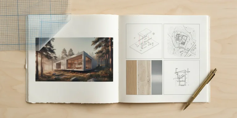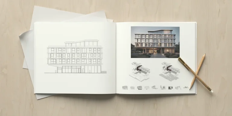
A landscape architecture portfolio is a curated document, usually a focused set of A3 spreads or a short PDF, that presents your design thinking, site analysis, technical drawings, and studio work to firms and graduate programs. A strong portfolio shows how you read a site, develop a concept, and resolve it through grading, planting, and detail.
Most reviewers spend under two minutes on a first pass. That means your landscape architecture portfolio has to communicate role, scale, and design quality almost instantly. This guide breaks down what to include, the right size and format, how to design a cover page, and the layout choices that separate a forgettable student portfolio from one that earns an interview. The advice applies whether you are an undergraduate chasing a first internship or a graduate targeting a senior studio role.
What Should a Landscape Architecture Portfolio Include?
A landscape architecture portfolio should include a cover page, a short bio or design statement, three to six projects, and a contact and credentials section. Each project needs a clear narrative that runs from site analysis to final design, supported by plans, sections, and at least one strong representational image such as a hand drawing, render, or model photo.
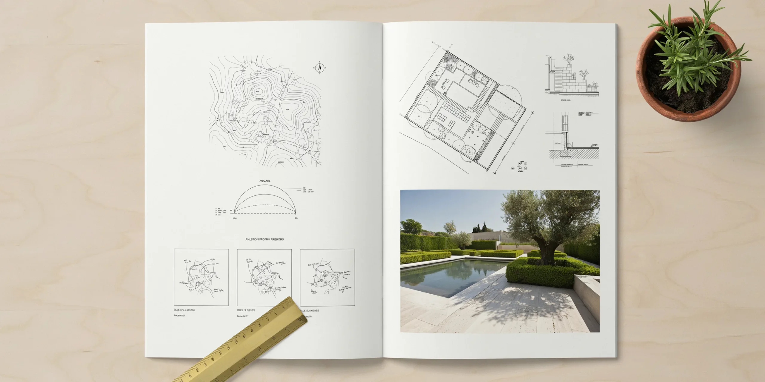
The work itself matters more than the volume of it. A portfolio with four sharp projects beats one padded out with ten weak ones. Reviewers connected to the American Society of Landscape Architects (ASLA) consistently note that students who show process, not just glossy final boards, read as more capable designers.
Here is a practical checklist of what belongs in most portfolios:
- Cover page with your name, the year, and a single representative image
- A one-line bio or design statement, kept to two or three sentences
- Site analysis: topography, hydrology, circulation, ecology, and context reads
- Concept diagrams that show how the idea evolved
- Master plans and detailed plans at readable scales
- Sections and elevations, including a grading or planting section
- Construction details or a planting plan to prove technical depth
- Representational work: hand sketches, perspectives, renders, or physical models
- A clear role attribution for any team or competition project
- Contact details and relevant memberships such as ASLA or your local chapter
💡 Pro Tip
For every project, write one sentence that states your actual role before you lay out the spread. Firms reviewing a landscape architecture portfolio want to know if you led the grading study or only colored the plan. Naming your contribution up front prevents the awkward interview moment where a reviewer assumes you did work you did not.
If you want a structured way to check coverage, our breakdown of how portfolios are scored shows the rubric categories that hiring reviewers actually weight, from concept clarity to layout and curation.
What Is the Best Size and Format for a Landscape Architecture Portfolio?
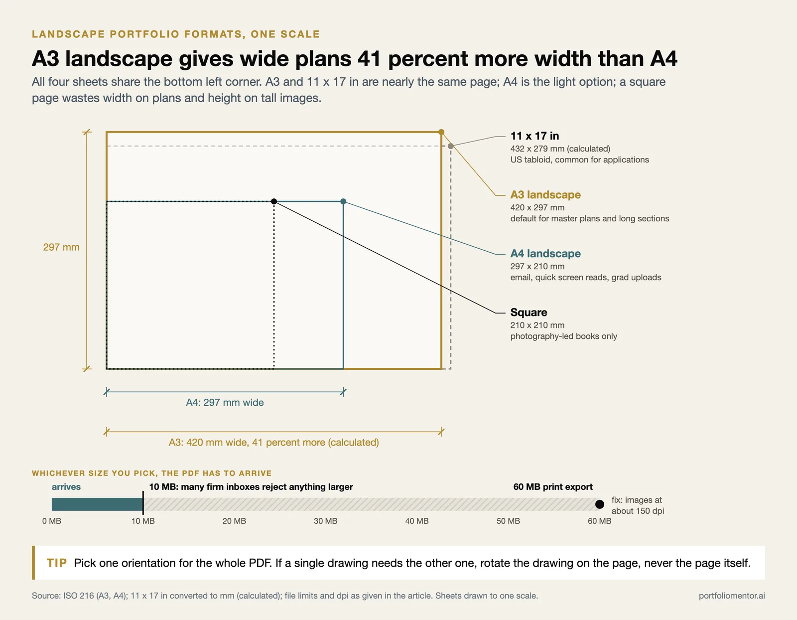
The best format is a landscape-oriented PDF in A3 or A4, kept under 10 MB so it clears email and upload limits. A3 (297 by 420 mm) gives wide plans and sections room to breathe, while A4 stays lighter and more portable. Many firms project portfolios on a large screen, so design for screen viewing first.
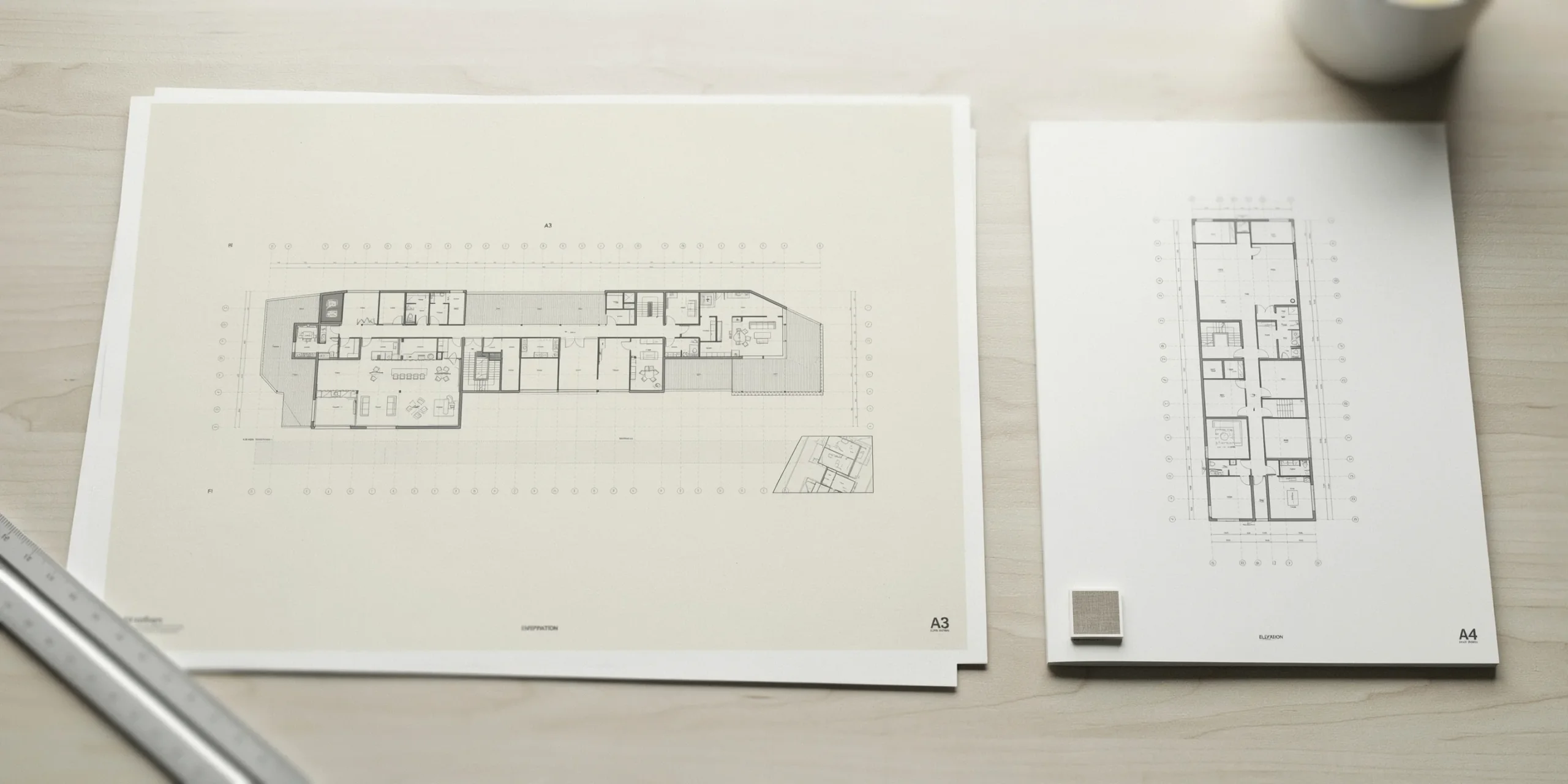
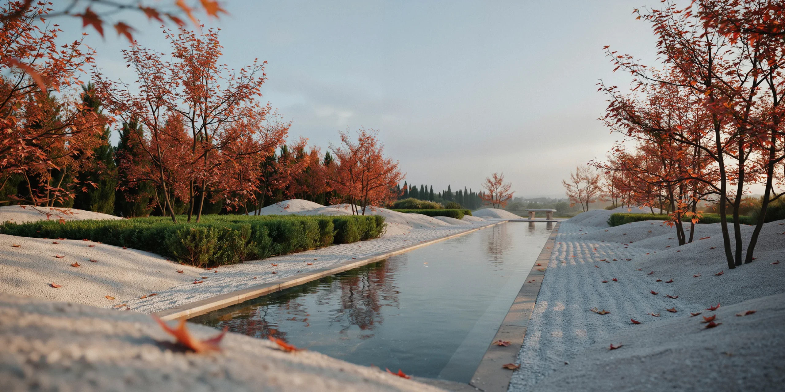
Landscape work is wide by nature. Site plans, long sections, and panoramic context views all favor a horizontal page, which is why A3 landscape is the common default for the discipline. According to Archisoup, a landscape-oriented PDF in standard A4 or A3 dimensions remains the industry baseline for job applications.
A3 Versus A4: Which Should You Use?
The choice between A3 and A4 comes down to your work and your audience. The table below compares the two for a typical applicant.
| Factor | A3 Landscape | A4 Landscape |
|---|---|---|
| Dimensions | 297 x 420 mm | 210 x 297 mm |
| Best for | Wide master plans, long sections | Email, quick screen reads, print |
| Screen viewing | Strong on large monitors | Good, more text-friendly |
| File weight | Heavier, watch the 10 MB cap | Lighter, easier to send |
| Common use | Firm applications, studio reviews | Grad school uploads, attachments |
⚠️ Common Mistake to Avoid
Exporting at full print resolution and emailing a 60 MB file. Many firm inboxes reject attachments over 10 MB, and grad school portals often cap uploads even lower. Compress images to roughly 150 dpi for screen, export an optimized PDF, and keep the file under 10 MB so it actually arrives.
Should a Landscape Architecture Portfolio Be Landscape or Portrait?
Yes, a portfolio can be landscape, and for landscape architecture it usually should be. Horizontal pages suit the drawings the discipline produces: master plans, long sections and panoramic context views. A3 landscape (297 by 420 mm) or 11 by 17 inches is the common default for job applications and studio reviews.
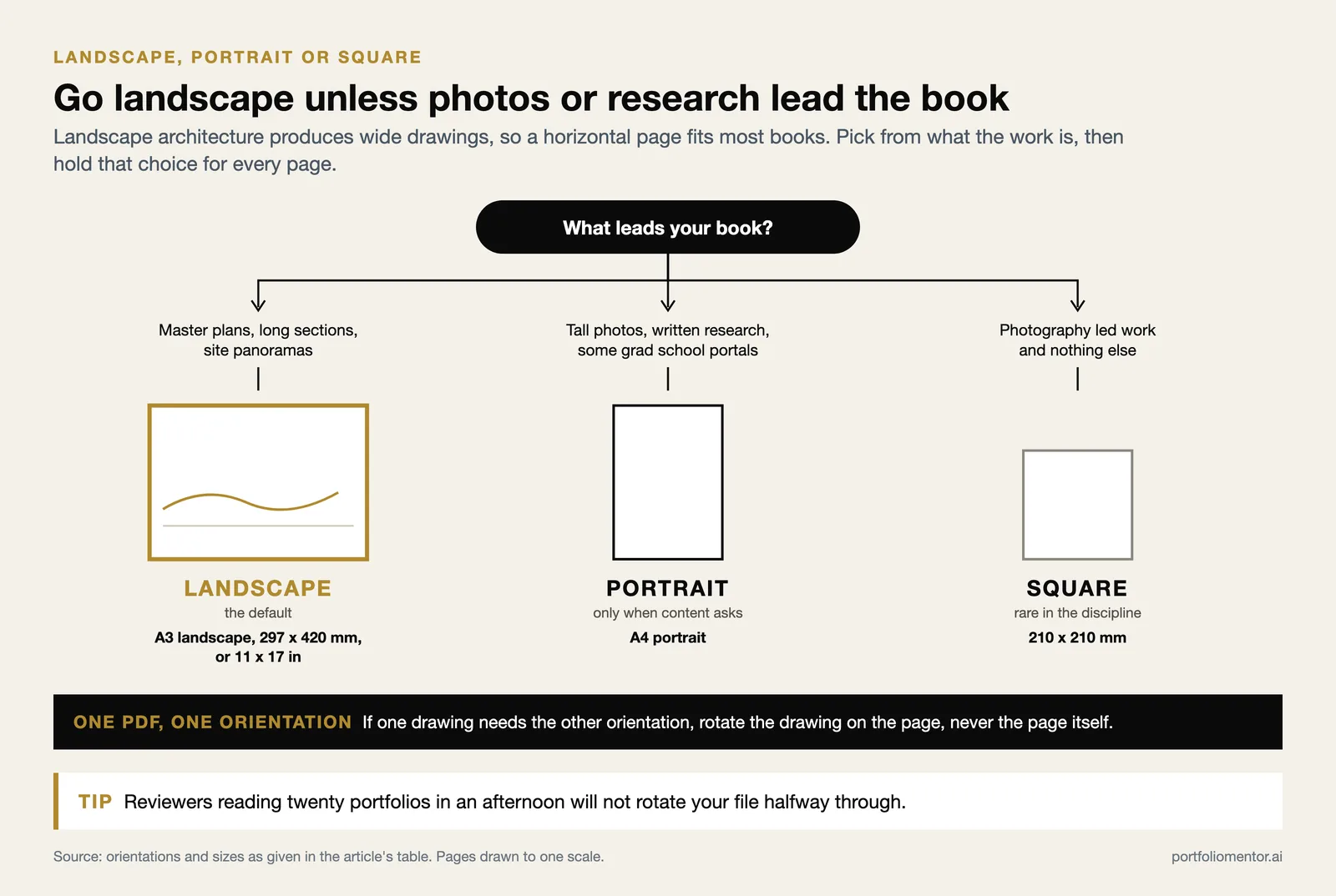
Choose portrait only when your content genuinely calls for it. A portfolio built mainly around tall photographs, written research or a text-heavy dissertation reads better vertically, and some grad school portals are designed around a vertical scroll. Square is a minority choice: it wastes width on wide plans and height on tall images, so it works only for photography-led books.
Whichever you pick, commit to it. Mixing orientations inside one PDF forces the reader to rotate the file mid-review, and reviewers reading twenty portfolios in an afternoon will not do it. If one drawing genuinely needs the other orientation, rotate the drawing on the page and keep the page itself consistent.
Landscape, Portrait or Square at a Glance
| Orientation | Use it when | Typical size |
|---|---|---|
| Landscape (default) | Master plans, long sections, site panoramas | A3 landscape, 11 x 17 in |
| Portrait | Photo-led or research-led books, some grad portals | A4 portrait |
| Square | Photography-led work only; rare in the discipline | 210 x 210 mm |
How Do You Design a Landscape Architecture Portfolio Cover Page?
Design your cover page to be simple, legible, and honest about your style. Lead with one strong image from your best project, place your name and the year clearly, and let typography guide the eye from the most important information down. Avoid clutter, busy backgrounds, and decorative fonts that fight the work.
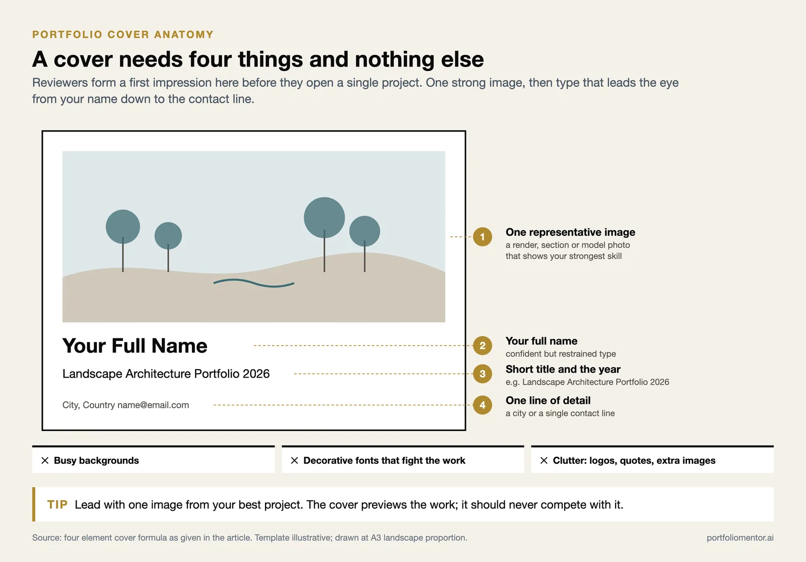
The cover sets the tone for the whole landscape architecture portfolio. Reviewers form a first impression here before they read a single project. According to Archifolio, a clear, high-impact main page that identifies you and previews your work is one of the strongest moves a student can make.
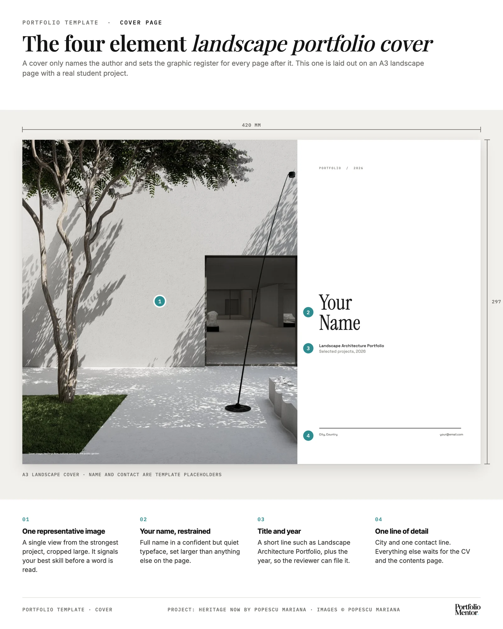
A reliable cover formula includes four elements:
- One representative image, usually a render, section, or model photo that signals your strongest skill
- Your full name in a confident but restrained typeface
- A short title such as “Landscape Architecture Portfolio” and the year
- Minimal supporting detail, such as a city or a single line of contact
📌 Did You Know?
Professional development and accreditation for landscape architects in the United States run through ASLA’s LA CES system, and many firms expect entry candidates to know the licensure path. Signaling your awareness of the profession, for example by listing ASLA student membership on your contact page, quietly reinforces that you see landscape architecture as a career, not just a degree.
How Should a Student Structure Each Project Spread?
For an undergraduate or early graduate, the project spread is where most portfolios succeed or fail. The goal is a readable narrative on every page, not a wall of drawings. A consistent grid, a clear reading order, and generous white space do more for your work than any single hero image.
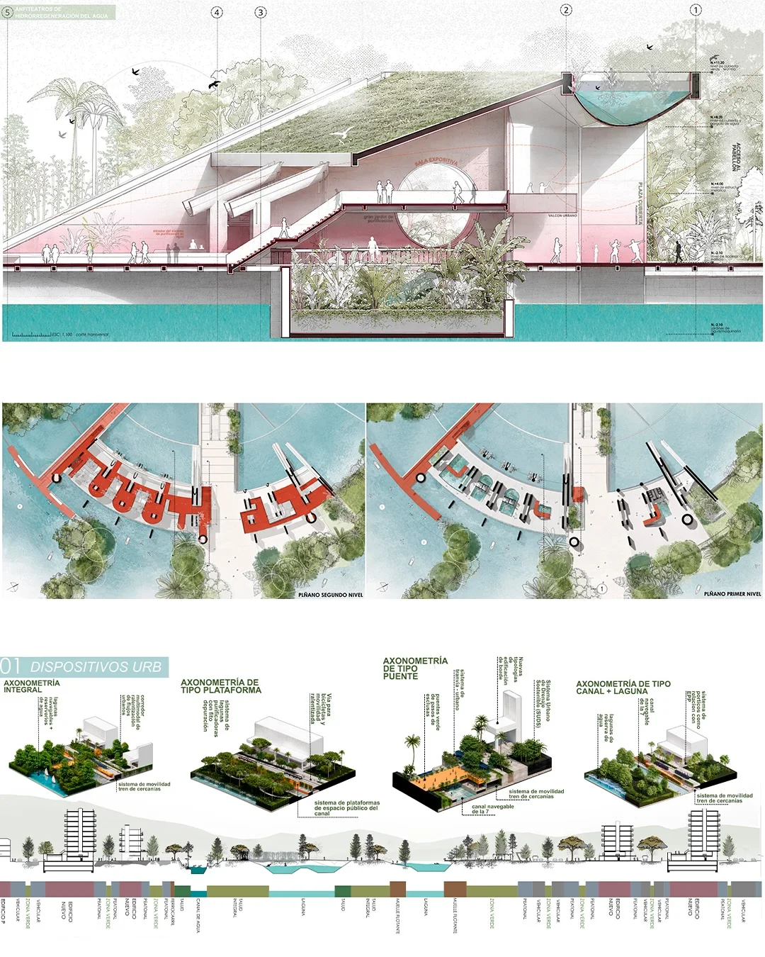
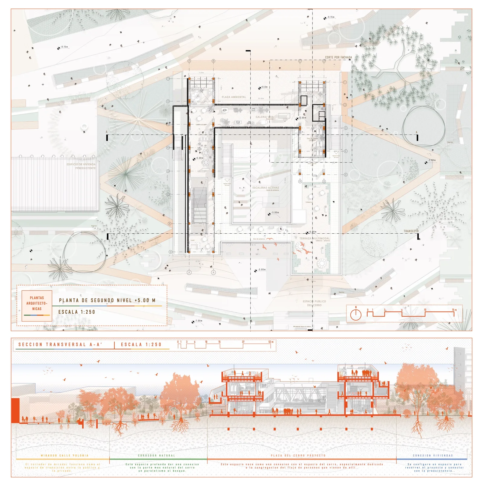
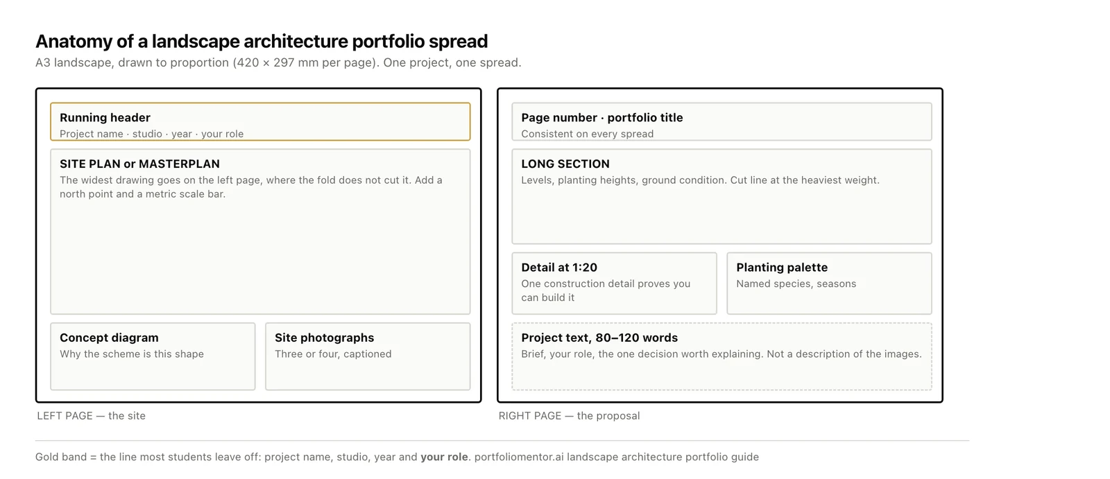
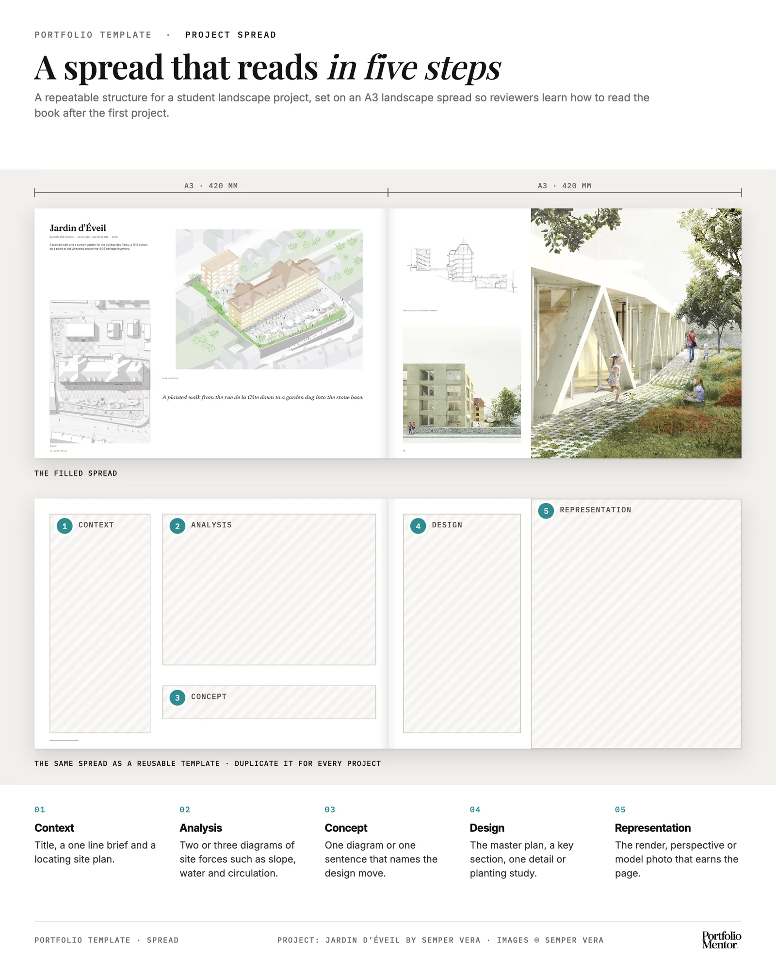
Use a repeatable structure across projects so reviewers learn how to read your work after the first spread:
- Open with context. A title, a one-line project brief, and a locating image or site map.
- Show the analysis. Two or three diagrams covering site forces such as water, slope, and circulation.
- State the concept. A single diagram or sentence that names the design move.
- Resolve the design. The master plan, a key section, and one detail or planting study.
- Close with representation. The render, perspective, or model photo that earns the page.
Consistency in typography, caption placement, and color carries across the document. Adobe Express guidance on portfolio layout stresses the same point: a stable grid and restrained palette read as intentional, while every spread looking different reads as scattered.
💡 Pro Tip
Build a master spread first, then duplicate it for every project. Set your margins, column grid, caption style, and page number once, then drop new content into the same frame. This keeps a student landscape architecture portfolio looking coherent even when the projects span very different scales and studios.
What a Landscape Architecture Student Portfolio Needs That a Professional One Does Not
A student portfolio is judged on thinking, not delivery. Because you have no built work, it has to show process: site analysis, the sketch where the idea appeared, the iteration you rejected and why. A practitioner can lead with completed projects; a student leads with evidence of how they reason.
Three things separate a strong student book from a weak one. First, name your role on every group project, in one line, so nothing is ambiguous. Second, label each project by type and year so the reviewer sees the balance of studio, dissertation and any paid work. Third, keep the set small: three to six projects that each show a different skill or scale beats ten that repeat one.
Not sure whether your own spreads read the way the ones described above do? Upload your landscape architecture portfolio and get a page-by-page read on hierarchy, spread structure and what a reviewer sees first.
Score my portfolio free →What Are the Best Landscape Architecture Portfolio Examples to Learn From?
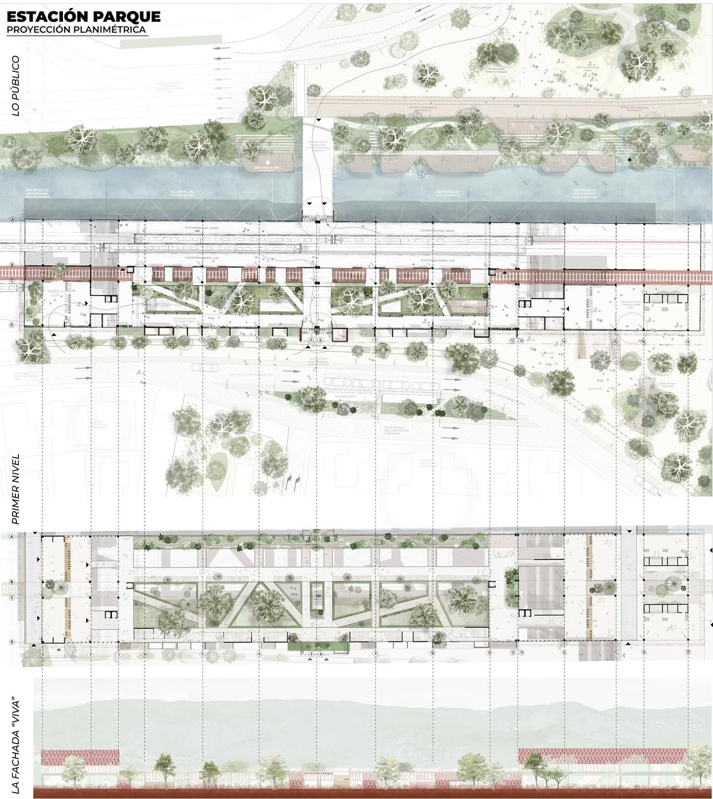
The best examples are not the most decorated ones. They are the portfolios whose layout does the explaining, so a reviewer flipping at speed still understands the site, the idea and your part in it. Below are three real landscape architecture portfolios, published by their authors on Behance, chosen because each one solves a different layout problem. Read the spreads first, then read the notes on what each one is doing.
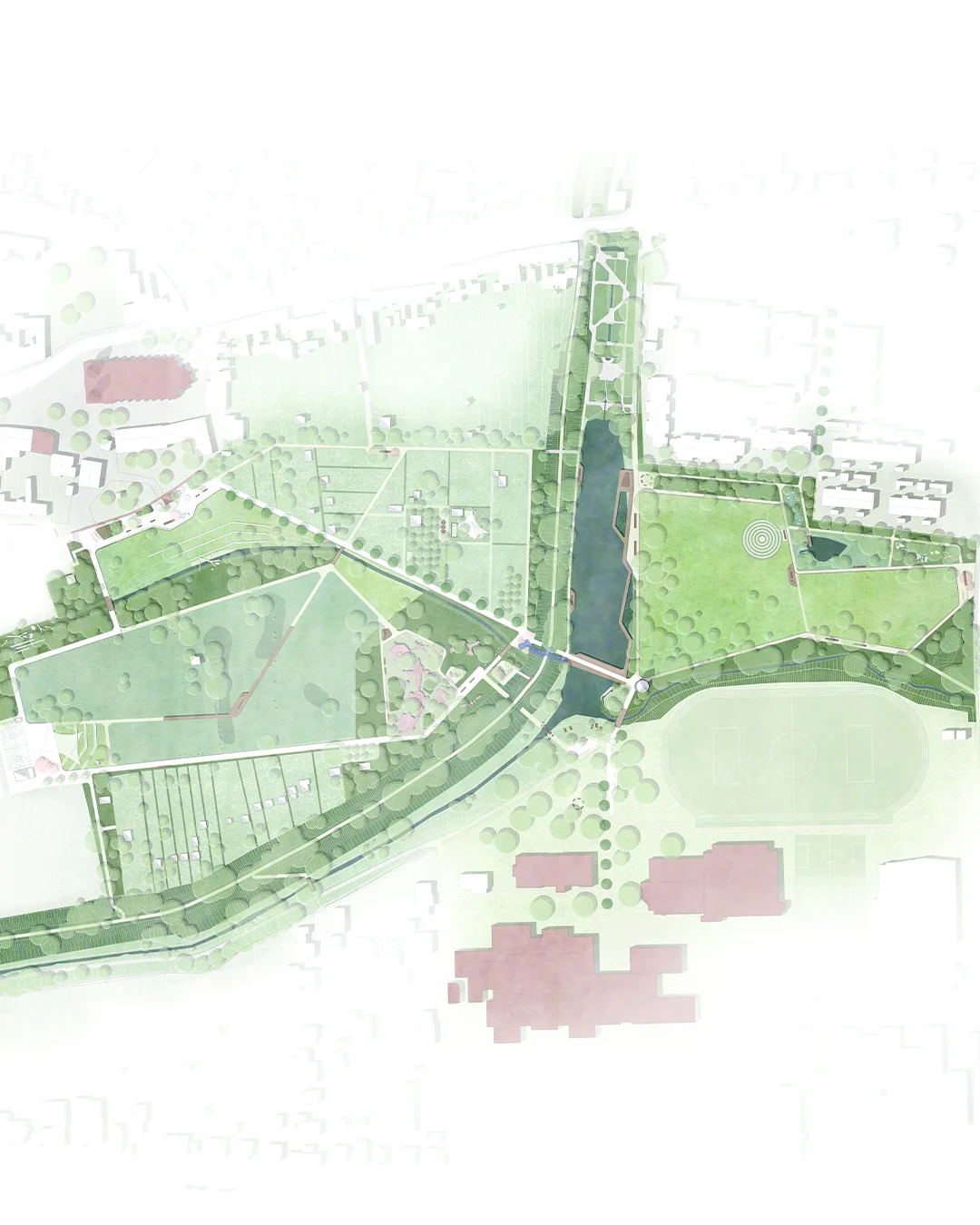
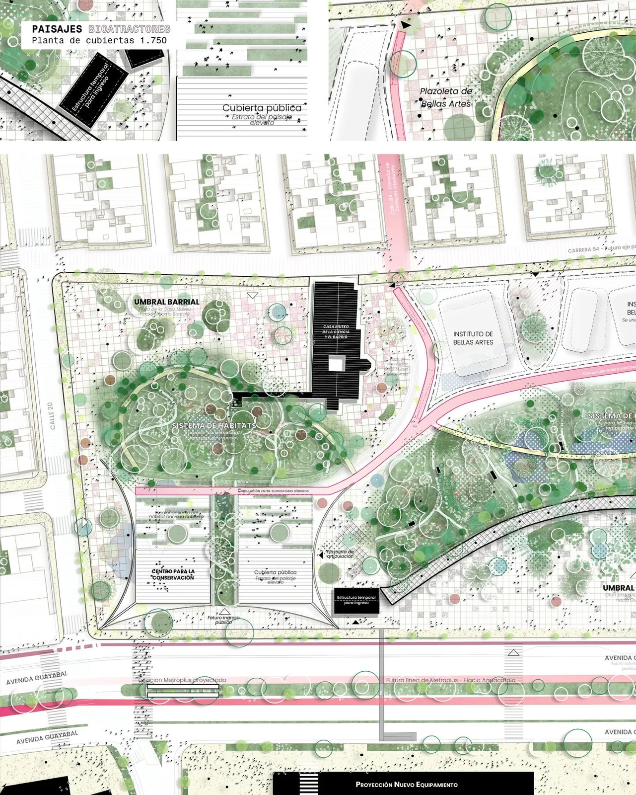
1. A student portfolio that answers “what did you actually do?”
Why this layout works
- Every project spread names a role. The Caorso power-station project is labelled “Group project”, and directly under it sits My Role: Concept, Design, Illustrations. That single line answers the first question any reviewer has about studio work, and most student portfolios leave it out.
- Text on one page, drawing on the other. The left page carries the abstract, the design task and the tutors; the right page is given entirely to the exploded axonometric. Nothing competes, and the reader is never hunting for the caption.
- Each project opens the same way. Running header, big numeral, abstract, design task, mentors, role. Once you learn the pattern on project 01 you can read 02 to 06 at a glance — which is exactly how portfolios are actually read.
- The contents page labels project type and year. “Academic Project: 2023–24”, “Professional Project: 2018–21”, “Dissertation Project”. A reviewer sees the balance of academic and paid work before opening a single project.
- The concept is carried by a diagram, not a render. The site is explained through a layered exploded axonometric with a small icon key, not a sunset visualisation.
2. A practice portfolio that shows the client, the role and the scale
Why this layout works
- A three-field header band on every spread. Project name on the left, the type of work and the practice in the centre, then role and client on the right — for example Lead Designer for UN-Habitat and the Cairo Governorate. Three facts a hiring manager needs, in one line, before any drawing.
- Captions name the drawing and give it a scale. The downtown mapping carries a written caption and a metric scale bar. This is the difference between a picture and a piece of professional evidence.
- Technical sheets instead of hero images. Street sections, kerb-cut details and a comparative study of local cycling typologies. For practice-level roles this reads as competence in a way renders do not.
- Phasing is drawn, not claimed. The route map has a legend separating first phase from second phase, so the proposal is legible as something deliverable.
3. A design-led portfolio where the contents page does real work
Why this layout works
- Each project is represented by its own site outline. The contents page uses the plot boundary of each site as its icon, with the number, the name and a page reference. It is instantly landscape-specific and it makes the contents page part of the design rather than an index.
- A fact block with the site area in it. Project, place, dimensions (106,500 m² for the Italia ’61 park), typology, course, tutors, team. Stating the size tells a reviewer what scale of work you have handled — a detail that almost every student portfolio omits.
- Three locator maps at three scales. Region, province, municipality, each with the site marked. Two seconds of reading replaces a paragraph of description.
- One restrained colour field holds the book together. A single muted olive ground runs through the dividers, so wildly different projects still read as one document.
Where to Find Landscape Architecture Portfolio Examples as PDFs
Most real portfolios circulate as PDFs, and the fastest places to read whole ones are Issuu and Behance, where authors publish the same file they send to firms. University departments are the other reliable source: schools such as LSU and the University of Washington publish graduating student portfolios from their landscape architecture programmes, which is the closest thing to seeing what actually got someone admitted or hired.
Read them as documents rather than galleries. Download or open one end to end, note how many pages it runs, where the reviewer would lose the thread, and how the author handled the project you find hardest to present. That is worth more than scrolling fifty covers.
How to read an example like a reviewer
When you review any portfolio, read it as a hiring manager would. Ask three questions on each spread: Can I tell what this designer did? Can I follow the idea from site to detail? Would I trust this person on a real project? A portfolio that answers all three, even with modest software skills, beats a glossy one that answers none.
University landscape architecture departments also publish graduating student portfolios, and platforms like Issuu and Behance host thousands more you can read end to end. To benchmark your own work against curated references and firm conventions, our overview of how Portfolio Mentor reviews architecture portfolios explains how reviewers calibrate feedback to your candidate level, from first internship to senior role.
Frequently Asked Questions
How many projects should a landscape architecture portfolio have?
Three to six projects is the sweet spot for most students and recent graduates. Quality and range matter more than quantity, so lead with your strongest work and cut anything that does not show a distinct skill or scale. A focused set of four projects almost always reads stronger than ten uneven ones.
Should a student portfolio include hand drawings?
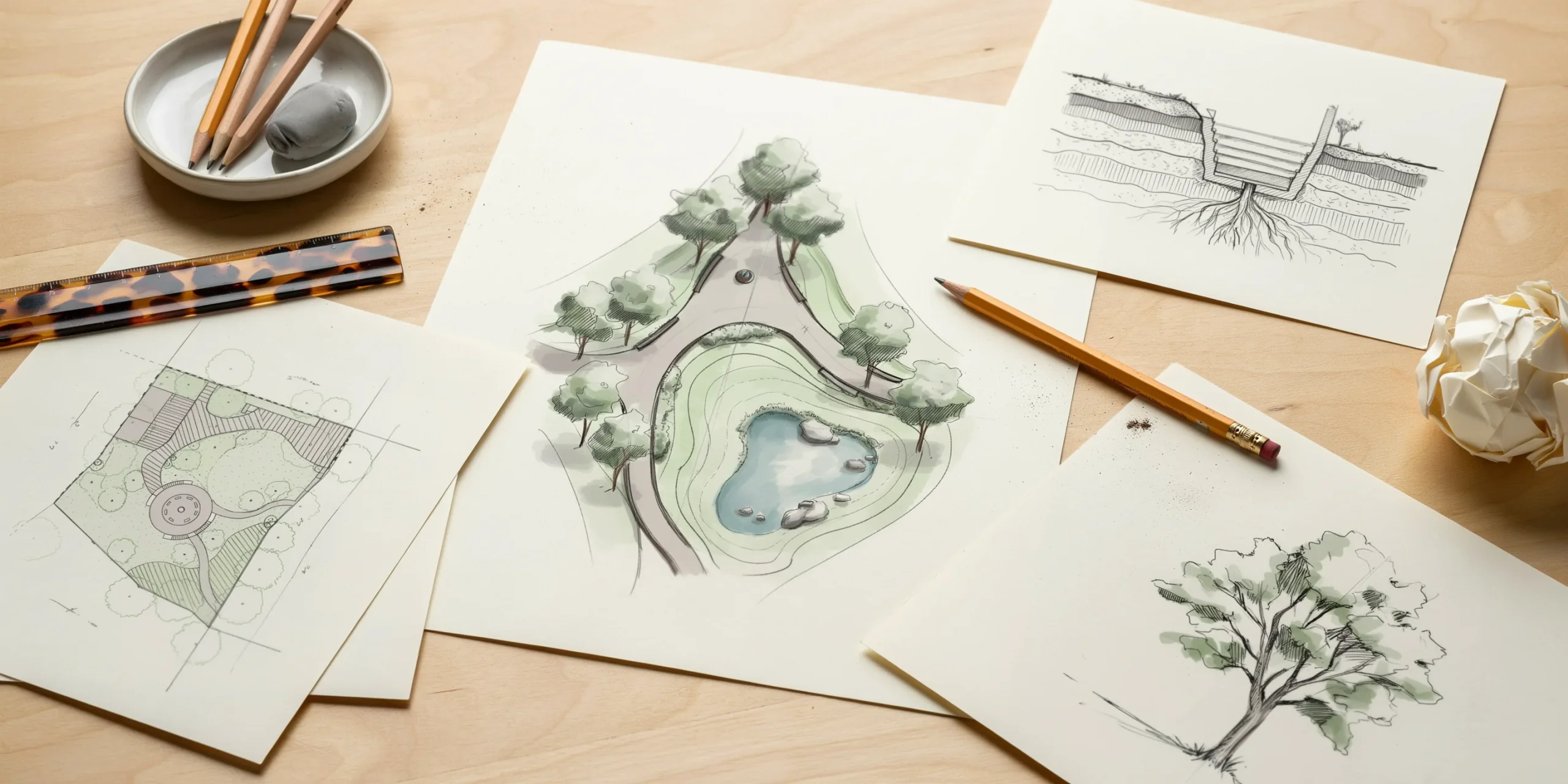
Yes. Hand sketches, diagrams, and study models show how you think and are often valued more than polished renders for early roles. They demonstrate process and design instinct, which firms use to judge potential. Include at least one or two pieces of hand work even if most of your portfolio is digital.
Do landscape architects need a website or just a PDF?
A PDF is the application standard, but a simple website helps for visibility and client work. Most firms request a PDF for hiring, so prioritize a clean, under 10 MB document first. A website is a useful complement once your PDF is solid, not a replacement for it.
What pay and outlook can landscape architecture graduates expect?
The U.S. Bureau of Labor Statistics publishes current median pay, education requirements, and job outlook for landscape architects in its Occupational Outlook Handbook. Checking it before you apply helps you set realistic salary expectations and understand the licensure path most employers expect.
Putting It All Together
✅ Key Takeaways
- Keep it tight: three to six strong projects, each with a clear narrative from site to detail.
- Export a landscape A3 or A4 PDF under 10 MB so it clears email and upload limits.
- Lead with a simple, legible cover that previews your best work and names you clearly.
- Use one repeatable grid so every spread reads as intentional and coherent.
- State your role on team and competition projects to build trust before the interview.
Your Next Step: Pull your three best projects into one A3 master spread, write a single sentence naming your role on each, and export an under 10 MB PDF before you touch a website. Get that core document right and the rest of your portfolio review and career toolkit becomes far easier to build on.